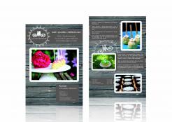
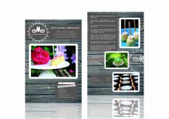
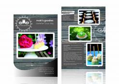
Advertising flyer / brochure for cake company
Contest details:
Silver
- Contest holder: mokisgoodies
- Category: Flyer, tickets
- Total budget: € 249.00
- Start date : 29-07-2013 23:33
- Ending date : 29-08-2013 23:33
- Status : Ended
- Required formats: jpg,psd,ai,pdf
- Relevant files: None
-
Available languages:


- Number of designs: 58
-
Response rate:
low high
Needs:
Until now there is no store, it is a catering service and delivery on demand.
The flyer / brochure shall be displayed in the partner locations / event locations we cooperate with.
Until now the marketing is done by a website: www.mokis-goodies.de and a Facebook account: www.facebook.com/mokisgoodies and of course word of mouth advertising.
As fortunately the business starts growing, we need a brochure for the partner event locations.
The existing logo should be used. Suggestions for an "update" are welcome.
Company description:
moki's goodies | delikat.essen = passion for baking since four generations. Cake creations for special occasions.
Traditional and handmade for your pleasure.
But also with a modern influence: we also offer sweets for those who have to go without certain ingredients.
Cakes, Tartes, Cupcakes are baked freshly an individually. Classic style with butter and organic eggs, vegan style without animal products, sugar free, gluten free or lactose free.
Passion for detail, best ingredients and local delivery ensure highest quality.
A store will be opened next spring, right now it's just a catering service and delivery. But there are also some partner-locations for events.
Target group:
Target customers for the advertising flyer / brochure are the guests of the partner locations. They plan a private or business event and are looking for a cake company to bring the cakes etc.
The events are birthday parties, wedding celebrations, christenings, receptions, conventions, conferences etc.
Colors, favourites and other requirements
You find photos of the cakes and sweets on my website www.mokis-goodies.de.
The design of the flyer / brochure should adapt the guideline of the cake-presentation: "rough luxe" as an emotional component of staging: exquisite sweets are displayed on rough wood plates for example.
"Rough-Luxe is a new way of looking at luxury as a moment in time and not only part of an object of consumption. Luxury is an enriching personal experience and not only an ownership of an expensive object.
Rough-Luxe is about the experience, the surrounding, the intrinsic value of objects, art, culture and the people surrounding us as well as the ‘‘consumable’’ items, that you come across."
Maarti Pictures
-
-
Maarti Pictures says
Hi Monika, I've tried to make changes as you've suggested, further changes are not a problem.
Best regards,
Martina @Maarti Pictures -
This contest is finished. Its not possible to reply anymore.
-
-
-
mokisgoodies says :
thanks a lot. the front looks better now :-)
in the text box with the address: i imagine it could bring some tranquility in the front, if the title "Kontakt" is without the white frame, but in the same size and style as the header on top "mokis.goodies | delikat.essen".
the second white framed header could be deleted then.
On the back: could you divide the text box in two parts? maybe one on the bottom on the right?
thanks & best regards,
monika -
This contest is finished. Its not possible to reply anymore.
-
-
-
mokisgoodies says :
Hi, thanks for the design. Is it supposed to be in A5 Size?
In the description I attached 2 files with the text that is needed in the flyer.
Could you add it & show how the flyer would look like inside?
I like the design. On the first page I think that the "curve"thing on the bottom is too much. Maybe the "wood" looks better without this cover or it should be a bit more transparent?
Thank you very much & best regards,
Monika -
Maarti Pictures says
Hi Monika, I will try to make these changes (use your text and adjust or remove the curve). Indeed I've meant the format to be A5.
Best regards,
Martina @Maarti Pictures -
This contest is finished. Its not possible to reply anymore.
-


