Flyer design or rework of our tinned food flyers
Contest details:
Bronze
- Contest holder: metzgerei27
- Category: Flyer, tickets
- Total budget: € 249.00
- Start date : 08-10-2014 17:01
- Ending date : 30-11-2014 16:59
- Status : Ended
- Required formats: jpg,ai,pdf; indd
- Relevant files: None
-
Available languages:


- Number of designs: 24
-
Response rate:
low high
Needs:
- modern and hip, yet serious design
- "delicious - hungry-making" charisma
- Manhattan gray and red are mainly used business colors, but this may quite possibly be a break in style in the interest of a better definition to our other business divisions
the current flyer can be seen here: http://www.metzgerei27.de/Spezialitaeten/Konserven
for more information about us, please visit our website www.metzgerei27.de (which on occasion should get a rework too)
Photos of our shop can be requested via hpm@metzgerei27.de
Since we are dealing with highly fluctuating commodity prices (by that I mean "permanently rise"), we need to revise the prices regularly (every 6 -12 months). Therefore, it would be good if the finished file would also be available as an Adobe Indesign, so we can make adjustments later ourself.
Company description:
you can find more information about us on our website metzgerei27.de; if something is unclear just ask :-)
Target group:
20-99 years, across the board
Colors, favourites and other requirements
The current format is A4, wrap fold
Additional Information: We have compiled a Picture, logo and photo collection in Dropbox. If necessary, I can send you the link via email.
kathrin1994
-
-
Description by designer kathrin1994:
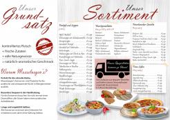
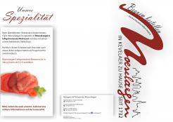
teil 2
-
metzgerei27 says :
schon besser, aber irgendwie fehlt mir da noch was
-
This contest is finished. Its not possible to reply anymore.
-
-
-
Description by designer kathrin1994:
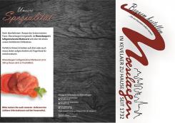
ich habe den hintergrund des flyers angepasst, sodass es nicht mehr so düster wirkt - Sie hatten recht, so erhält er viel mehr Klarheit und auch Modernität
-
This contest is finished. Its not possible to reply anymore.
-
-
-
Description by designer kathrin1994:
Flyer im Stile der Corporate Identity - Außenseite
-
metzgerei27 says :
hm, sehr düster um nicht zu sagen depressiv. die eingekürzten texte hingegen gefallen mir gut
-
This contest is finished. Its not possible to reply anymore.
-
-
-
Description by designer kathrin1994:
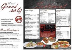
Flyer im Stile der Corporate Identity - Innenseite
-
kathrin1994 says
Ich habe beim Flyer bewusst auf lange, ausführliche Texte verzichtet. Zudem habe ich bei den Grundsätzen auf einen weißen Hintergrund gesetzt, da die Farbe auf den Endverbraucher psychologisch mit einem positiven Image verbunden wird.
-
This contest is finished. Its not possible to reply anymore.
-


