ISSOL Cenit Visual - Flyer
Contest details:
Silver
- Contest holder: lquittre
- Category: Flyer, tickets
- Total budget: € 249.00
- Start date : 20-05-2013 15:30
- Ending date : 03-06-2013 15:28
- Status : Ended
- Required formats: jpg,psd,ai
- Relevant files: None
-
Available languages:

- Number of designs: 23
-
Response rate:
low high
Needs:
See: http://www.issol.eu/temp/CENIT%20VISUAL_%20COMP.pdf
The current design is not nice and doesn't look professional.
The texts, the logos, the colors, the company informations must stay the same.
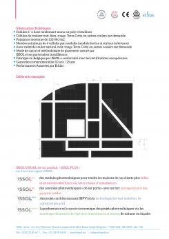
The plans and drawings must be re-done much better.
The fonts, the brochure layout must be done much better
The pictures must be re-work, edited, re colored to look brighter and nicer. The sky must be blue.
The small logos above on page 2 must be stay but can be redone
Get inspired by our Internet Site: www.issol.eu and by our complete product brochure. You work be done with the same "spirit" of the brochure see:
http://www.issol.eu/upload/downloads/catalogue_ISSOL_2012_FR.pdf
You can use on of the following picture (to re-edit and make brighter)
https://picasaweb.google.com/103105345729932069225/ISSOLPLUS_CenitVisual?authuser=0&authkey=Gv1sRgCKDjn6C7rNHu7AE&feat=directlink
Thank you!
Company description:
see www.issol.eu
Target group:
The data sheet presents a new product that we have developed. It is intended for professionals and installers. It allow them to make very customized photovoltaic installations for residential homes (roofs). The photovoltaics panels are cut, design according to the size of the roof. It covers the whole roof going around cheminée, roof windows,... It fills the complete roof surface with customized photovoltaic panels.
Colors, favourites and other requirements
Official Colors
Main ISSOL Logo
Gray: RGB 124 124 122
Bue: RGB 0 136 204
ISSOL Plus:
Gray: RGB 124 124 122
Pink : RGB 228 74 144
ISSOL Pro:
Gray: RGB 124 124 122
Brown : RGB 208 72 48
ISSOL Archi:
Gray: RGB 124 124 122
Blue : RGB 73 72 142
ISSOL Finance:
Gray: RGB 124 124 122
Green : RGB 114 175 79
I forgot to mention that Font should be "Gill sans".
crane
-
-
lquittre says :
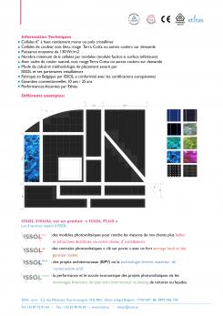
It's not bad with the color cells but we have seen some of you competitor making better. We don't think it's a good idea to change to insert color cells in (the blue that you have put) in the original black drawing.
-
This contest is finished. Its not possible to reply anymore.
-
-
-
lquittre says :
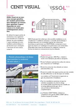
we like the blue block with the white text inside.
The pictures are a little bit too "unreal". It looks like roofs in the Caribbean. This is Belgium, you know! It rains 300 days/year. People won't believe this.
Sorry for beeing direct. We know you spent time on this. -
This contest is finished. Its not possible to reply anymore.
-
-
-
lquittre says :
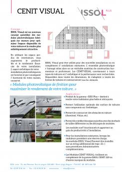
oh, what an ugly Font.
Gill sans might be more of our taste. -
This contest is finished. Its not possible to reply anymore.
-
-
-
lquittre says :
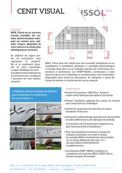
we forgot to mention, the font should be "gill sans".
we like the 4 pictures. You could replace one by the previous pictures or the origninal document. The sky could be blue... or not as grey (this is Belgium!!).
The upper right drawing on the first page should be remake, to look better.
-
lquittre says :
I have added a new image that could be use also https://picasaweb.google.com/lh/photo/MvJ21tTHQEGRiRCLWdJnSNMTjNZETYmyPJy0liipFm0?feat=directlink
-
This contest is finished. Its not possible to reply anymore.
-
-
-
Description by designer crane:
hello,
If have uploaded my first concept
if you have any questions please let me know.
i will editing the pictures soon
kind regards
Jimmy
hope to hear from you -
lquittre says :
with the link here below; you have access to an application that shows different cell colors (blue, green, black, etc); Those are the different colors possibilities to build a solar panels. In the current version of your document, the cells are black. It is the default color. However, the customer has the possibility to ask a different color.
It would be nice to find a place on your document to display those color possibilities, so the customer would understand that he has the choice.
If you could display somewhere in the document, in a nice layout, the diffirent cells, it would be nice. It would also make the document a little bit more attractive.
http://www.issol.eu/custo/index.php
If you click on a colored cell. It becomes bigger. Then you can "save as" and use it in your doc. -
lquittre says :
the black drawing is nice and pure. We like it very much.
-
This contest is finished. Its not possible to reply anymore.
-

