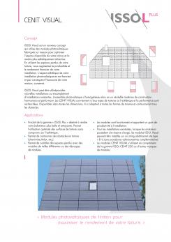
ISSOL Cenit Visual - Flyer
Contest details:
Silver
- Contest holder: lquittre
- Category: Flyer, tickets
- Total budget: € 249.00
- Start date : 20-05-2013 15:30
- Ending date : 03-06-2013 15:28
- Status : Ended
- Required formats: jpg,psd,ai
- Relevant files: None
-
Available languages:

- Number of designs: 23
-
Response rate:
low high
Needs:
See: http://www.issol.eu/temp/CENIT%20VISUAL_%20COMP.pdf
The current design is not nice and doesn't look professional.
The texts, the logos, the colors, the company informations must stay the same.
The plans and drawings must be re-done much better.
The fonts, the brochure layout must be done much better
The pictures must be re-work, edited, re colored to look brighter and nicer. The sky must be blue.
The small logos above on page 2 must be stay but can be redone
Get inspired by our Internet Site: www.issol.eu and by our complete product brochure. You work be done with the same "spirit" of the brochure see:
http://www.issol.eu/upload/downloads/catalogue_ISSOL_2012_FR.pdf
You can use on of the following picture (to re-edit and make brighter)
https://picasaweb.google.com/103105345729932069225/ISSOLPLUS_CenitVisual?authuser=0&authkey=Gv1sRgCKDjn6C7rNHu7AE&feat=directlink
Thank you!
Company description:
see www.issol.eu
Target group:
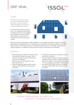
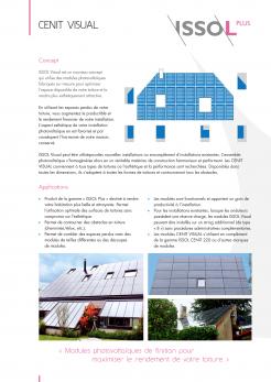
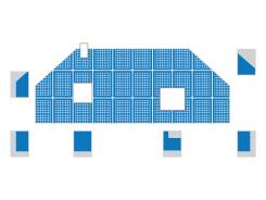
The data sheet presents a new product that we have developed. It is intended for professionals and installers. It allow them to make very customized photovoltaic installations for residential homes (roofs). The photovoltaics panels are cut, design according to the size of the roof. It covers the whole roof going around cheminée, roof windows,... It fills the complete roof surface with customized photovoltaic panels.
Colors, favourites and other requirements
Official Colors
Main ISSOL Logo
Gray: RGB 124 124 122
Bue: RGB 0 136 204
ISSOL Plus:
Gray: RGB 124 124 122
Pink : RGB 228 74 144
ISSOL Pro:
Gray: RGB 124 124 122
Brown : RGB 208 72 48
ISSOL Archi:
Gray: RGB 124 124 122
Blue : RGB 73 72 142
ISSOL Finance:
Gray: RGB 124 124 122
Green : RGB 114 175 79
I forgot to mention that Font should be "Gill sans".
Mills
-
-
No comments
-
This contest is finished. Its not possible to reply anymore.
-
-
-
Description by designer Mills:
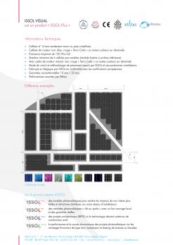
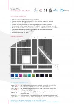
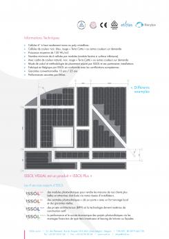
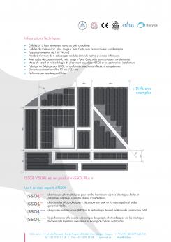
Now with more black in the main drawing.
-
This contest is finished. Its not possible to reply anymore.
-
-
-
Description by designer Mills:
I also put some cells in the cutted pieces in the first drawing.
-
This contest is finished. Its not possible to reply anymore.
-
-
-
Description by designer Mills:
Once more the front of the data sheet.
Now with the updated illustration of the cutted cells. -
This contest is finished. Its not possible to reply anymore.
-
-
-
lquittre says :
the drawing above is already much better. It can probably be improved a little bit. It is important that we understand the we are talking about solar panels of different shapes.
-
This contest is finished. Its not possible to reply anymore.
-
-
-
lquittre says :
brilliant. The idea of the color cells at the bottom. This is exactly what we were expecting.
-
lquittre says :
the main drawing with the cut pieces of solar panels assembled together is very good. But it would look even better if if would be slightly darker (more black). As you have done, it is very good that we can still distingish the cells inside each solar panel. May be the contrast could be a bit softer. For sure, it is the best drawing that we have seen.
-
This contest is finished. Its not possible to reply anymore.
-
-
-
Description by designer Mills:
Better drawing first picture on frontside
-
lquittre says :
Yes, it looks quite good.
-
This contest is finished. Its not possible to reply anymore.
-
-
-
lquittre says :
Font should be "Gill Sans". I forgot to say.
-
lquittre says :
with the link here below; you have access to an application that shows different cell colors (blue, green, black, etc); Those are the different colors possibilities to build a solar panels. In the current version of your document, the cells are black. It is the default color. However, the customer has the possibility to ask a different color.
It would be nice to find a place on your document to display those color possibilities, so the customer would understand that he has the choice.
If you could display somewhere in the document, in a nice layout, the diffirent cells, it would be nice. It would also make the document a little bit more attractive.
http://www.issol.eu/custo/index.php
If you click on a colored cell. It becomes bigger. Then you can "save as" and use it in your doc. -
This contest is finished. Its not possible to reply anymore.
-
-
-
lquittre says :
Font should be "Gill Sans". I forgot to say. it would be nice to have better text alignement.
-
lquittre says :
Maybe you want to do something with this picture also. But it needs to be edited to make brighter, focus on the roof because the it's not very visible.
https://picasaweb.google.com/lh/photo/PmJnqK2xF5G1dfo5pgJPxkIoN_2iqZAkgdj5xmaLu4g?feat=directlink -
This contest is finished. Its not possible to reply anymore.
-
-
-
lquittre says :
what you have done, is not bad at all.
However, if you could make the drawing on the fist page (roof with cut solar panels) look better, more professional.
Also, I have created a new picasaweb link with 1 or 2 pictures that would be nice to integrate in the product datasheet. The are are very grey. Would be nice to edit them so, they look better.
Thanks -
This contest is finished. Its not possible to reply anymore.
-
-
-
Description by designer Mills:
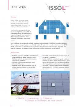
I translated the text with OCR.
Not shure about the first picture, it is very blurry and hard to see how it is drawn. The picture of the building is also not a high quality image in basic. -
This contest is finished. Its not possible to reply anymore.
-

