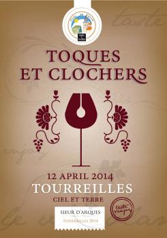
Poster for the 25th edition of Toques and Clochers - International event in the world of wine and gastronomy
Contest details:
Silver
- Contest holder: l.tribillac
- Category: Flyer, tickets
- Total budget: € 249.00
- Start date : 30-04-2013 14:32
- Ending date : 30-05-2013 14:26
- Status : Ended
- Required formats: jpg,psd,ai
- Relevant files: None
-
Available languages:


- Number of designs: 136
-
Response rate:
low high
Needs:
- The date of the event: (12 April 2013)
- The logo of the event
- The name of village elected for this new edition: “Tourreilles “
- (Headline of the village : « Ciel et Terre »)
The advertise will be used for the creation of :
300 Posters A3
1000 wine labels
Company description:
Sieur d’Arques, key actor in the Languedoc, organizes since 1990 an event combining wine, food and heritage called Toques et Clochers.
Toques et Clochers is a charity auction of wine chaired by Chef *** Michelin, whose profits go to the renovation of the 42 towers of the villages of the appellation Limoux, thus contributing to the preservation of local historical and architectural heritage.
Every year since 24 years, a village is selected to host the festival attracting about 30,000 people.
The next edition will take place the weekend of Palm Sunday 2013 (Saturday, April 12th, 2013)
IMPORTANT: During the festival, only white wine and sparkling wine can be enjoyed
Goal of the advertise: get people to come to the festival (animation / tasting/party)
Target group:
General public, professionals and wine lovers
Colors, favourites and other requirements
Mooiniet
-
-
Description by designer Mooiniet:
Bonjour,
Hereby I send you my poster. My inspiration came from a vintage wine- label. I tried to translate a rich and festive feel into it. When you see this poster anywhere, without reading, you will know it's about wine.
I used substitute text instead of the black, square logo. Is there any change you have this logo in vector/eps? It is quite small now.
I hope to hear from you, I can always make adaptions.
Merci!
Jorina - mooiniet -
This contest is finished. Its not possible to reply anymore.
-

