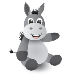
Basti a cute donkey
Contest details:
Gold
- Contest holder: i-mondi
- Category: Illustration, drawing, fashion print
- Total budget: € 349.00
- Start date : 27-05-2013 19:14
- Ending date : 07-06-2013 16:00
- Status : Ended
- Required formats: aiCinema 4
- Relevant files: None
-
Available languages:


- Number of designs: 48
-
Response rate:
low high
Needs:
What we are missing:
- He is not cute enough that somebody would say: "ooooh" - should have more a BABY-Look
- He looks like a big blob of gray tones we are missing shades, curves, reflections etc
Eventhough what we like:
- He kinda looks like its model
- That he is gray
- The pose meaning that he sits - eventhough we need a second pose
- That he does not have the body of an animal four-legged he has a "Baby Body"
- The fact that we have an opened filein matter to do any required changes
The old AI file as well as photos from the original plush in many pose you can finde under www.i-mondi.com/download/Basti.zip
# # # # # # # # # # Supplement # # # # # #
It's about redesigning our mascot, this means to stylize the stuffed animal in the zip-file. Initially, since our old AI file was only revised, we have taken it from the zip file. If you still have the old AI file, please do not take our old file as a template. Please direct the focus to the stuffed animal and interpret it by yourself. The result should be a complete character, not just a head or a upper body. Each possible pose is welcome.
WE DONT WANT TO COPY ANYTHING - BUT TO GET AN IMPRESSION OF WHAT WE LIKE WE ARE PUBLISHING HERE SOME LINKS
1ST PLACE: Very sweetly we find the Zebra (top center)
http://www.babyland-online.com/images/articles/58b5036e7b8b10eefd47b0d156fcd6b4_5.jpg
2ND PLACE:
http://www.wuff-dogsworld.de/media/catalog/product/cache/1/image/500x500/5e06319eda06f020e43594a9c230972d/f/i/file_181_32.jpg
Company description:
Target group:
Colors, favourites and other requirements
michelle88
-
-
Description by designer michelle88:
Dear client,
I have made a few changes to the design. I hope you like them. I changed the following:
- I have added gradients.
- I have added shadows under his body and under his snout.
- I changed the snout a little. In the original the snout is a bit to big and the shape looks a bit strange. Therefore the snout draws all the attention so I have made it a little smaller and a bit more round. Also in the original version the mouth and his nose looks a bit like a smiley so I also changed that. The mouth now is much more friendly and appealing to children.
- Last but certainly not least I have adjusted the eyes. The eyes are very important for the "baby look" and making Basti look cuter. I've made them bigger and added the white circles to make them more lifelike and vivid, a little sparkle.
Feedback is always very welcome. I'd love to hear what you think.
Kind regards,
Michelle -
iMondi says
Please do not take our old file as a template. Please put your focus on the stuffed animal and interpret it by yourself. Besides that the eyes are nice but too big but in general too related to the old one.
-
This contest is finished. Its not possible to reply anymore.
-

