Cuckoo Sandbox
Contest details:
Gold
- Contest holder: jbremer
- Category: Illustration, drawing, fashion print
- Total budget: € 279.00
- Start date : 30-05-2015 10:33
- Ending date : 27-06-2015 10:30
- Status : Ended
- Required formats: jpg,ai,pdf
- Relevant files: None
-
Available languages:


- Number of designs: 49
-
Response rate:
low high
Needs:
Name: Jurriaan Bremer
Job title: Principal Consultant Cuckoo Technology
Email: jbr@cuckoo.sh
Optionally my website: jbremer.org
Optionally my phone number: +31 6 4674 0016
I have attached my old business card "design" which was a default vistaprint design that I liked quite a bit - so a bit darker colors would be cool, but with the logo (cuckoo.png) the colors can't be very dark, as that would render the logo useless (I guess).
Furthermore, you can't see it on the uploaded image (old.jpg), but with that business card I had the option in vistaprint to use "metallic print", which highlighted some of the text. That was pretty awesome and if possible I'd definitely like to see that again in the new design.
Company description:
I work in the IT Security / Cyber Security area.
Target group:
My services (consultancy) targets Cyber Security companies.
Colors, favourites and other requirements
hypdesign
-
-
Description by designer hypdesign:
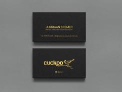
Update for previously uploaded golden foil card.
-
jbremer says :
I like it - nice and simple :)
-
This contest is finished. Its not possible to reply anymore.
-
-
-
Description by designer hypdesign:
One more option to reconsider - went through your web site a little, so I figured....
-
jbremer says :
I get your motivation behind this design, and it's nice, but it doesn't really work on my target audience which may not be always 100% technical.
-
hypdesign says
No problem, just a thought. :)
-
This contest is finished. Its not possible to reply anymore.
-
-
-
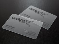
hypdesign says
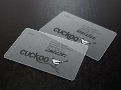
Reworked the layout a little. Bird "fill" and long title is now back.
-
jbremer says :
Definitely potential in this one! :)
-
Toobe.art says
Hi Hypdesign,
Nice design! It is a shame that's it's look like mine.
Good luck with the contest.
Toobe.art - Beatrice -
hypdesign says
?
-
hypdesign says
This transparent card mock up is available to everyone, not sure what you mean.
http://graphicburger.com/translucent-business-cards-mockup/ -
This contest is finished. Its not possible to reply anymore.
-
-
-
jbremer says :
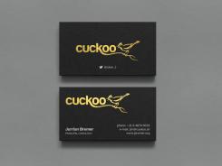
I do like this gold color, though ;)
-
This contest is finished. Its not possible to reply anymore.
-
-
-
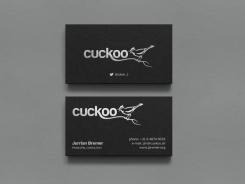
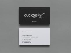
Description by designer hypdesign:
A few more options, silver and gold foil.
-
jbremer says :
Silver is not really my color.
-
This contest is finished. Its not possible to reply anymore.
-
-
-
jbremer says :
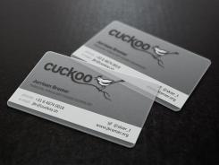
This one is pretty cool (as the other transparant one). But I do still feel more for the other one for the following reasons: the non-transparant bird, partial job title (although the Cuckoo logo sort of makes up for that, but still), maybe would make more sense if the phone/email/site was more consistent/aligned? And you got my name wrong, but that's just a small fix away ;)
-
hypdesign says
Ah, yes. Sorry about that. Will be fixed :)
-
This contest is finished. Its not possible to reply anymore.
-
-
-
jbremer says :
The cuckoo text on the back is not very well readable, I think? The layout of the rest is quite okay, though.
-
This contest is finished. Its not possible to reply anymore.
-
-
-
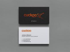
Description by designer hypdesign:
Here is copper and silver foil option.
-
jbremer says :
Would probably have to see the real version to decide - I'm a little bit afraid it doesn't express a professional attitude.
-
This contest is finished. Its not possible to reply anymore.
-

