Designers Champions League design for start up
Contest details:
Silver
- Contest holder: GalaGo
- Category: Illustration, drawing, fashion print
- Total budget: € 369.00
- Start date : 02-12-2021 15:47
- Ending date : 09-12-2021 00:00
- Status : Ended
- Relevant files:
-
Available languages:


- Number of designs: 69
-
Response rate:
low high
Needs:
Demands: Modern (5/10) - Young (7,5/10) - Man/Female (5/10) - Playfulness (7,5/10) - Luxury (5/10) - Geometric (5/10) - Abstract (5/10)
Colour Palletes: Purple included
Target: Multicultural, male/female, 30-50 years old, working in food industry
Additional:
We are receiving complaints over copy-paste acts from several artists. Wether or not any rules are broken here, is not up to GalaGo, but the platfrom Brandsupply that is facilitating in this. GalaGo is offering a reward for the design that fits the above profile the most. That is what we need.
Yet, if the winning design turns out to be obvious copy-behaviour, we will approach the original designer first and offer him or her the opportunity to finalize the original design according to our final feedback.
Making copy-behaviour useless, we request all designers to focus on the designs, and do a request on your personal inspiration as well as we believe the field of the food-sector is wide enough to do so. Thank you and good luck.
Company description:
Target group:
Colors, favourites and other requirements
A cute, playful GalaGo with a high cuddling factor must be included. The playfulness should be used to make sure it will not only be attractive to female and younger public, but men as well.
Company Slogan: Have GalaGo.
KPS
-
-
No comments
-
This contest is finished. Its not possible to reply anymore.
-
-
-
KPS says
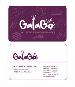
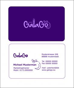
Hier Versuch mit Galago mittig in Schrift integriert mit Besteckkrone! Bin gesoannt wie es gefällt.
Here experiment with Galago integrated in the middle in writing with cutlery crown! I am known as I like it. -
This contest is finished. Its not possible to reply anymore.
-
-
-
No comments
-
This contest is finished. Its not possible to reply anymore.
-
-
-
KPS says
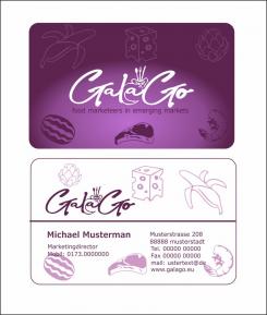
Feedback welcome! Thanks
-
GalaGo says :
Hello and thank you for your design. We have received quite a few designs in short time already, and are in the phase of selecting the best. Your design is amongst them, and tastes like more.
I called this the Champions League for a reason. I will need the very best design for this project, and looking for the Ronaldo in you as a designer. Besides, GalaGo has a policy to never take satisfaction with a first design, because we are confident that you will have more in you to impress us, and we would like to see it.
This is the honest feedback I can give to you, and hope it will be useful to you and motivate you. The first time I looked at it was in small format on my phone and somewhat in a rush, it didn't immediately catch me like the other designs which seem more basic than this one, and 'easy to keep in mind'. Taking my time on the laptop later, and studying the front logo a few seconds longer and closer, I still think it is less recognizable than others, but
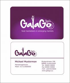
actually do like it a lot and is among my personal favorites. It differs from other designs in positive way, the fork, the animal, the 'have', there is definitely a story told in it. I do think the animal should be placed on the 'o' at all times, in my opinion the name 'GalaGo' on the backside looks a bit incomplete without it.
Most designs we liked include a fork since they have all received the suggestion to create a link with food as well. We can see you are sharp as a knife, and either realized or noticed this already.
But like said, we have given the fork as an example only. If you think you have a better idea to link the logo with food in any other way, we will welcome any personal inspiration. In fact, we would love it. I came up with the fork in seconds to give an example only. We represent all food brands and companies so cheese, chocolate, fish, bakery, fresh produce, use your imagination although we do really like this particular fork in this design as well.
The font was like looking at the logo for the first time. Not sure at first, but impressed in second opinion. It is catchy, readable without being an average all-day font. Maybe a bit more fatness could make it a bit more clear from distance or at first sight. I also like to see this one with the text line below: Food Marketeers in Emerging Markets.
Compliments for your work so far, we definitely see the potential Ronaldo in your designer skills. Impress us.
-
KPS says
Thanks for your constructive Feedback!
-
KPS says
Thanks for your constructive Feedback!
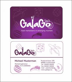
Here with the first small changes. -
This contest is finished. Its not possible to reply anymore.
-

