No comments
Designers Champions League design for start up
- Contest holder: GalaGo
- Category: Illustration, drawing, fashion print
- Status: Ended
- Files: File 1
Start date: 02-12-2021
Ending date: 09-12-2021
It all started with an idea...
A short, interactive guide helped them discover their design style and clearly captured what they needed.
Brandsupply is a platform where creative professionals and businesses collaborate on unique projects and designs.
Clients looking for a new logo or brand identity describe what they need. Designers can then participate in the project via Brandsupply by submitting one or more designs. In the end, the client chooses the design they like best.
Costs vary depending on the type of project — from €169 for a business or project name to €539 for a complete website. The client decides how much they want to pay for the entire project.
No comments
No comments
Check please ..
regards joe hart
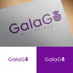
No comments
Hello Joe,
thank you for submitting your design. We like it a lot and see potential in your designing skills. The animal in your design has the right amount of cuteness over it, and can be linked to the food sector as well.
Feedback I would still be able to give on this design, is that the font could possibly be a bit more alive. Our logo is to be found and recognized on major food exhibitions around the world. It will need to catch the eye somehow without becoming too messy or unclear, maybe look into some more fat fonts? You should look for some kind of a balance there. Good luck, we have faith you have it in you to impress us more with your designer skills.
Thank you, I will revise the logo design.
regards joe hart
 Nederland
 België
 France
 Deutschland
 Österreich
 International
