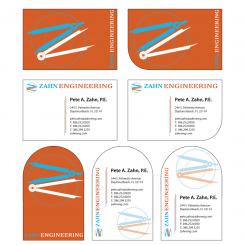
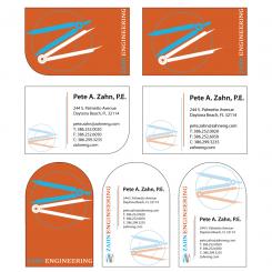
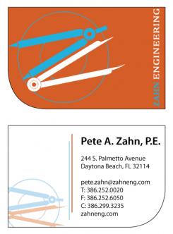
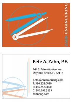
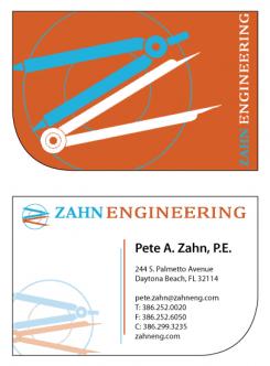
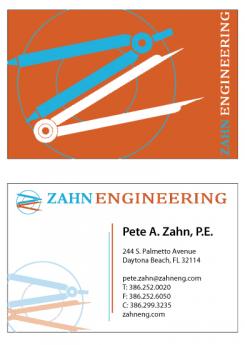
Engineering firm looking for cool, professional business card design
Contest details:
Gold
- Contest holder: kevin xD
- Category: Illustration, drawing, fashion print
- Total budget: € 279.00
- Start date : 24-02-2016 17:02
- Ending date : 02-03-2016 17:01
- Status : Ended
- Required formats: jpg,ai,pdf
- Relevant files: None
-
Available languages:

- Number of designs: 56
-
Response rate:
low high
Needs:
Zahn Engineering
Details to include on the business card:
Pete A. Zahn, P.E.
244 S. Palmetto Avenue
Daytona Beach, FL 32114
pete.zahn@zahneng.com
T: 386.252.0020
F: 386.252.6050
C: 386.299.3235
zahneng.com
Company description:
Zahn Engineering has been providing Civil Engineering, land planning and permitting services in the Volusia County area since 1978. The firm has experience in the areas of land planning, feasibility studies, zoning and land use, site plan design, permitting, water and sanitary sewer design and permitting, stormwater management system design and permitting, subdivision design, and construction management.
Target group:
Study the website carefully to understand Zahn's business. We provide civil engineering services to building developers and architects. We are not architects. We are not builders. We do not design bridges. I'd like a 2-sided card with the logo prominently displayed on one side. The tagline "Trusted Engineers Since 1978" should only appear once on the card. You can be creative on the shape as well. It doesn't have to be a rectangle.
Existing website to reference:
zahneng.com
Colors, favourites and other requirements
What to avoid:
No bridges. No electronics. No chemistry or biology. No skyscrapers.
UncleTee
-
-
No comments
-
This contest is finished. Its not possible to reply anymore.
-
-
-
Description by designer UncleTee:
Hi Kevin,
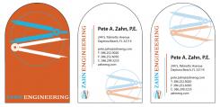
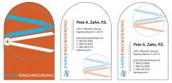
As requested, the designs without cut-off logo's. Hope you like it!
kind regards, Terry -
UncleTee says
PS. If you do choose to pick my design, could you send me the original design files for your logo? This way I can make sure the lines are nice and crisp, and the colours match the original design 100%. Thanks in advance!
-
This contest is finished. Its not possible to reply anymore.
-
-
-
No comments
-
This contest is finished. Its not possible to reply anymore.
-
-
-
kevin xD says :
Remove the one on the bottom left of the card. Not the one from the top.
-
This contest is finished. Its not possible to reply anymore.
-
-
-
No comments
-
This contest is finished. Its not possible to reply anymore.
-
-
-
No comments
-
This contest is finished. Its not possible to reply anymore.
-
-
-
Description by designer UncleTee:
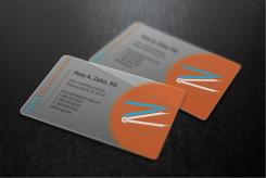
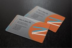
here's a version on translucent pvc. I chose a one-sided design, because using both sides would mean both designs would be visible on both sides, which would interfere with each other and cause an unreadable business card. With this design, this would be avoided. Hope you like it!
kind regards, Terry -
kevin xD says :
Great this version, but you need to fit the entire logo on it. Thanks.
-
UncleTee says
Fixed that for you, hope you like it!
-
This contest is finished. Its not possible to reply anymore.
-
-
-
No comments
-
This contest is finished. Its not possible to reply anymore.
-
-
-
No comments
-
This contest is finished. Its not possible to reply anymore.
-
-
-
kevin xD says :
Great graphic work. I'd like to see a bit more variety on the material and shape.
-
kevin xD says :
So far this is my favorite design, would like to see it in other versions. Thank you.
-
UncleTee says
Thanks for the compliment! I'm working on some variations right now, I'll send you some asap!
-
kevin xD says :
Could you shrink the logo a little to fit entirely on the backside of the card? And remove the logo on the front? Thanks.
-
kevin xD says :
I would prefer to see a larger version of the logo on the back side of the card.
-
UncleTee says
Sure, no problem. Just to be clear: do you want the logo on the "orange" side to be smaller to fit, and the logo on the adress side gone? And by gone do you mean the top one or the one on the side? thanks
-
kevin xD says :
I like your designs. One comment. When you put the logo on the card, I would prefer that no part of the 2 compasses that form the "Z" are cut off. The 2 compasses should be completely displayed. Thanks.
-
kevin xD says :
Remove the one on the bottom left of the card. Not the one from the top.
-
This contest is finished. Its not possible to reply anymore.
-

