A women's community that come together to get FIT
Contest details:
Gold
- Contest holder: Emílio Mestre
- Category: Logo design
- Total budget: € 399.00
- Start date : 01-02-2016 18:26
- Ending date : 08-02-2016 18:23
- Status : Ended
- Required formats: jpg,ai,pdf
- Relevant files: None
-
Available languages:

- Number of designs: 112
-
Response rate:
low high
Needs:
Logo: FemmeFitness
Tagline: Together We FIT
Company description:
Fitness center for women.
Target group:
A community for women to be inspired and feel more self-confident.
Colors, favourites and other requirements
I'd like to explore the color purple: Imagination, spirituality, royalty and luxury.
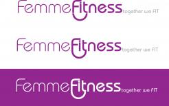
Ami had done some designs for the original name - FemmeFit. Her designs were good. She had a circle around FIT which made it look like a community of people coming together for FIT
Purple is the base color - a true vibrant purple.
logomaker
-
-
No comments
-
This contest is finished. Its not possible to reply anymore.
-
-
-
No comments
-
This contest is finished. Its not possible to reply anymore.
-
-
-
Emílio Mestre says :
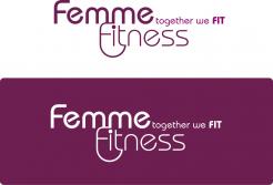
We prefer non stacked.
-
Emílio Mestre says :
You can make the fitness bold instead of femme perhaps and show a half circle that looks like people coming together around fit. We can do a variation without the tag line.
-
This contest is finished. Its not possible to reply anymore.
-
-
-
Emílio Mestre says :
How can I send you a picture of another design that I like to use with your font? You can make the fitness bold instead of femme perhaps and show a half circle that looks like people coming together around fit. We can do a variation without the tag line.
-
Emílio Mestre says :
And we Prefer non stacked.
-
Emílio Mestre says :
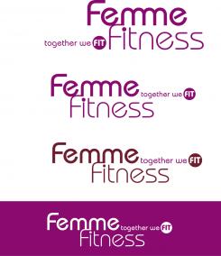
Hi, we would like to see variations of this. Not stacked. The first part. With deep true purple as base color. Can add in Aqua as well if it will look good. Font for tag line is best on last one. Thank you for your work!
-
Emílio Mestre says :
Sorry, please ignore the prior comment. It was meant for the previous design, ranked with 3 stars.
-
This contest is finished. Its not possible to reply anymore.
-
-
-
Emílio Mestre says :
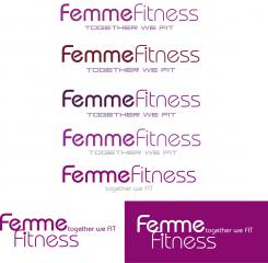
Love this font. Try some variations maybe a circle around Fit or something. Shows coming together to get "fit". No separated icon.
-
Emílio Mestre says :
Hi, we would like to see variations of this. Not stacked. The first part. With deep true purple as base color. Can add in Aqua as well if it will look good. Font for tag line is best on last one. Thank you for your work!
-
This contest is finished. Its not possible to reply anymore.
-
-
-
Emílio Mestre says :
Love the font, no graphic though, unless embedded in text somehow. can you show me some variations with two colors? Deep purple is one.
-
Emílio Mestre says :
Love this font. Try some variations maybe a circle around Fit or something. Shows coming together to get "fit". No separated icon.
-
This contest is finished. Its not possible to reply anymore.
-


