10th anniversary of a global network of local and regional authorities
Contest details:
Silver
- Contest holder: United Cities
- Category: Logo design
- Total budget: € 299.00
- Start date : 18-11-2013 17:28
- Ending date : 27-11-2013 16:46
- Status : Ended
- Required formats: jpg,ai,pdf
- Relevant files: None
-
Available languages:

- Number of designs: 95
-
Response rate:
low high
Needs:
The logo should reflect this new stage for the organization and represent achievement, progress, evolution and continuation. They logo can also contain the number 10. Using the date - 2004-2014 - is also possible.
We need to be both stand alone and usable with the a short slogan:
100 years of action, 10 years of unity
Company description:
United Cities and Local Governments (UCLG) represents and defends the interests of local governments on the world stage, regardless of the size of the communities they serve. Headquartered in Barcelona, the organisation’s stated mission is: To be the united voice and world advocate of democratic local self-government, promoting its values, objectives and interests, through cooperation between local governments, and within the wider international community. - See more at: www.uclg.org
Target group:
Our members
Colors, favourites and other requirements
See PDF although we are flexible: orange, grey, green and red are all colours we use.
mot
-
-
mot says
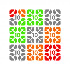
The effect when the logo would be combined: it shows how the 'arms' of the human figures form circles (network)
-
This contest is finished. Its not possible to reply anymore.
-
-
-
mot says
My new proposal.
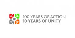
Here the idea of a network is visualized by the stylized ‘human figures holding out their arms ’ in each curved square. They’re like veins of a leaf, making the logo also look a bit like a flower (growth, celebration!)
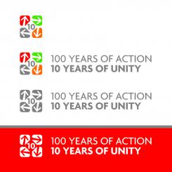
The logo can either be used ‘stand alone’ and in combination with the text, in black and white or using color. Feedback is welcome, let me know if you have further suggestions for improvement.
-
This contest is finished. Its not possible to reply anymore.
-
-
-
No comments
-
This contest is finished. Its not possible to reply anymore.
-
-
-
mot says
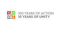
Dear United Cities, as you can see, I've been aiming for 'simple and clear' to be the main qualities of this design, since this makes for the strongest and best recognisable logo. I'm looking forward to receive your feedback, best regards, mot
-
United Cities says :
Hi Dit, again I like this logo a lot, I would maybe take out the arrows to avoid the idea of 'going round in circles' but good use of colours and our curved squares
-
mot says
Hmm, that was not the impression I was hoping to achieve… Rather that the arrows would create a network between the curved squares, and an overall idea of ‘connecting to each other’, ‘ongoing development’, etc
-
This contest is finished. Its not possible to reply anymore.
-


