20 years anniversary, PARKETT KÄPPELI GmbH, Parquet- and Flooring
Contest details:
Silver
- Contest holder: ParkettKaeppeli
- Category: Logo design
- Total budget: € 329.00
- Start date : 12-01-2016 07:52
- Ending date : 20-02-2016 23:13
- Status : Ended
- Required formats: jpg,ai,pdf,eps,png
- Relevant files: None
-
Available languages:


- Number of designs: 101
-
Response rate:
low high
Needs:
This year Parkett Käppeli celebrates the 20th anniversary (www.parkett-kaeppeli.ch).
For this occasion we are looking for a new design for our company logo. Basically it should stay as it is in shape and colour to keep the recognition effect but added by a lettering that expresses the anniversary year. We imagine a modern and fresh design style that should contain the text “20 Jahre”, also including the annual figures “1996 – 2016” could be taken into consideration. The lettering could be designed in the colours already given by the basic logo or in metallic silver.
The colors of the present logo: Pantone yellow and Pantone 072 Reflex Blue
Company description:
Specialist store in the flooring sector with the main focus on parquet, floor boarding and customized solutions. Located in Kanton Aargau, Freiamt, Switzerland (address: Schachenweg 2, CH-5634 Merenschwand) the company welcomes customers to visit the 2’200m2 showroom, where any kind of floor boarding on large surfaces are shown.
Target group:
Architects, private clients of 25-80 years, General contractor
Colors, favourites and other requirements
Pantone Yellow und Pantone 072 Reflex Blue or metallic silver
Font Meta bold italic
Zane_Gereisa
-
-
Description by designer Zane_Gereisa:
Hello,
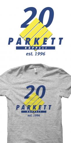
I created the logo putting 20 behind the design and adding est. 1996 at the bottom, so after your 20 th anniversary you can have that adjustment still to know the age of your company.
I made it in Blue colour to make the overall harmony in all design.
Regards,
Zane -
This contest is finished. Its not possible to reply anymore.
-
-
-
Description by designer Zane_Gereisa:
And here is the same design using opposite colour to the Jahre and year dates.
Regards,
Zane -
This contest is finished. Its not possible to reply anymore.
-
-
-
Description by designer Zane_Gereisa:
Hello,
I created the adjustment to your logo keeping the same design that you had, not to confuse your customers. I made 20 in silver to accent stability and other added words and numbers in yellow and blue to keep the same colour scheme.
Looking forward hearing from you,
Regards,
Zane -
This contest is finished. Its not possible to reply anymore.
-


