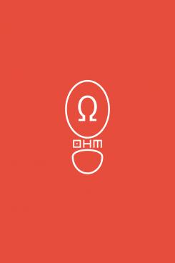
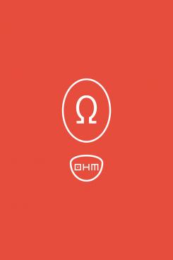
A modern, yet simple and a bit play logo for a children's shoe brand.
Contest details:
- Contest holder: logo11
- Category: Logo design
- Total budget: € 100.00
- Start date : 10-10-2016 13:52
- Ending date : 17-10-2016 13:51
- Status : Ended
- Required formats: jpg,ai
- Relevant files: None
-
Available languages:


- Number of designs: 97
-
Response rate:
low high
Needs:
Design a modern, simple and yet a little bit playful logo for a new Dutch children's shoe brand. My desire really goes for a modern, simple.....and yet a little bit playful kind of style. A 'simple' logo that we can use for: putting the brand logo in the shoe, the paper, the website etc. But also an easy logo to being able to remember.
Pro's:
-The logo must look fresh and new and inviting.
-The logo shall be used to put on the shoes and shall be used as a statement for everything to follow. Just a strong statement.
Background new company:
Name: OHM (this means resistance)
Style: a style that can be explained as Playful, Modern and Vintage.
Quality: High.
Price: is mid-high segment - which we would like to show to customers.
Advice: The Omega sign can be put into the logo. But this is not a must! See the enclosed attachments of the omega sign. This is just an example but definitely not necessary to use these examples. Please feel free to make it as modern, or whichever kind of logo you want. Because they are just examples and can be definitely better and nicer than the ones you see enclosed.
Please let your creativity go wild. Looking very much forward to your concept.
Thanks in advance!
Company description:
Dear everyone,
Design a modern, simple and yet a little bit playful logo for a new Dutch children's shoe brand. My desire really goes for a modern, simple.....and yet a little bit playful kind of style. A 'simple' logo that we can use for: putting the brand logo in the shoe, the paper, the website etc. But also an easy logo to being able to remember.
Pro's:
-The logo must look fresh and new and inviting.
-The logo shall be used to put on the shoes and shall be used as a statement for everything to follow. Just a strong statement.
Background new company:
Name: OHM (this means resistance)
Style: a style that can be explained as Playful, Modern and Vintage.
Quality: High.
Price: is mid-high segment - which we would like to show to customers.
Advice: The Omega sign can be put into the logo. But this is not a must! See the enclosed attachments of the omega sign. This is just an example but definitely not necessary to use these examples. Please feel free to make it as modern, or whichever kind of logo you want. Because they are just examples and can be definitely better and nicer than the ones you see enclosed.
Please let your creativity go wild. Looking very much forward to your concept.
Thanks in advance!
Warm regards!
Target group:
Children
Colors, favourites and other requirements
Black or Dark Grey (Antracite)
But am open to other colours.
TM
-
-
logo11 says :
I like it. But the H looks almost like letter N. Another lettertype maybe? Should be open for both boys and girls. But close?
-
TM says
Is gezien de naam niet goed duidelijk te maken met een script lettertype.
Vandaar dat ik in de andere ontwerpen met een symetrisch lettertype heb gewerkt.
Deze ondersteund ook meer het universele beeld van je merk.
Juist door geen aandacht te schenken het verschil in meisjes vs jongens
Dit kun je altijd nog doen door kleurgebruik.
-
logo11 says :
Ja idd. Het is wel lastig zo. Ik heb dat lettertype nog nodig. Dat onderstaande is iets te strak...maar heeft ook wat hoor. Ik kijk er ook nog even naar.
Daarnaast is dat script lettertype dus lastig...
Oké, heb even wat tijd nodig hiervoor. Ik laat het even bezinken. -
logo11 says :
Beste Designer, bedankt voor alle alle alle genomen moeite! We hebben zojuist een winnaar geselecteerd. We hebben het gevoel dat deze perfect bij ons merk past. Daar is de keuze dan ook op gevallen.
Zojuist heb ik een e-mail gestuurd naar Brandsupply om de wedstrijd eerder te mogen sluiten. Nogmaals, onze dank is groter dan je denkt! -
This contest is finished. Its not possible to reply anymore.
-
-
-
logo11 says :
Thnx voor je snelle reactie. Sorry...I mean, thanks for your quick reply!
A few remarks:
-if you google 'young soles shoes' and 'pepe children shoes'. You will find two different types or lettertypes. Can you give me a few samples with such a comparable lettertype(s) and then using that for only one word: OHM.
-I hope I explain it correctly. But hope you can help me out.
Thanks!! -
TM says
't mag gewoon nederlands hoor
-
This contest is finished. Its not possible to reply anymore.
-
-
-
logo11 says :
Dankjewel
-
This contest is finished. Its not possible to reply anymore.
-
-
-
logo11 says :
Thanks. A few remarks:
-Could you take out the ohm sign? And then let me take another look at it?
-I still have thoughts on the lettertype. But, I would like to see it again without the omega sign in the sole.
thnx in advance...cheers! -
This contest is finished. Its not possible to reply anymore.
-
-
-
logo11 says :
Thanks again of course!
Few remarks:
-It is interesting to see all the text as I requested myself;) It seems like too much text right now;)
-Can you take out the 'Amsterdam est 2016'? Maybe I will just use such text on website etc.
-But for the logo: when looking at the white & black version? Is there something you can do with the OHM word? I like this current version, on how you write OHM, also. But I would like to see it finetuned. Like: If you put a simple and tight omega sign in the letter O. And then of course following with H&M. So I mean, that you can still read it as one word OHM. Otherwise it would be possibly too much in this logo.
Hope to hear from you. Cheers again! -
logo11 says :
PS) And this one, I just commented on is really tight. You can really tell it's a shoe too...in a completely different angle. Pretty cool;)
-
TM says
Dankje/Thanks
-
This contest is finished. Its not possible to reply anymore.
-
-
-
logo11 says :
nice
-
This contest is finished. Its not possible to reply anymore.
-
-
-
logo11 says :
Well, this one I am looking at it differently right now.
Few remarks:
-I believe it is better to take out the OHM sign on the sole.
-Can you put in that ohm sign in the way you write OHM now? I hope I am writing it correctly but here it goes: So I mean: the omega sign...can you use this as the letter O (in the word OHM)? And then make that tight/ neat as well? -
This contest is finished. Its not possible to reply anymore.
-
-
-
logo11 says :
nice (still looking at your concepts...give me a few minutes please:)
-
This contest is finished. Its not possible to reply anymore.
-
-
-
No comments
-
This contest is finished. Its not possible to reply anymore.
-
-
-
logo11 says :
Thank you for your designs!
Some remarks:
-I like the lettertype
-Could you use the colour Black/ Antracite?
-Could you use the lower part of this logo?
-Could you down one version write est. 2016 Amsterdam below it
-And another version with 'kinderschoenen' in below it
Looking forward to it. Thanks! -
This contest is finished. Its not possible to reply anymore.
-

