Agilists
Contest details:
Gold
- Contest holder: Ruyter
- Category: Logo design
- Total budget: € 479.00
- Start date : 08-02-2015 11:13
- Ending date : 30-03-2015 21:09
- Status : Ended
- Required formats: jpg,psd,ai,pdf
- Relevant files: None
-
Available languages:


- Number of designs: 299
-
Response rate:
low high
Needs:
Targeted audience are both business and technically oriented people. Some are already fully warmed up for the concept and others need some persuading.
So the logo must challenge the audience to change, give a comfortable feeling that change isn't scary, give an outlook for better ROI. It must also show the audience that this is the next natural step. Target companies are looking for better ways, may be struggling with keeping employees.
Company description:
Agilists is a company that help IT companies with the introduction or coaching of Scrum. See https://www.scrum.org and http://www.agilemanifesto.org.
Target group:
IT companies. Managers and technologists.
Colors, favourites and other requirements
Suggestion for a logo emblem maybe an artisticly drawn unicorn or a cheetah or jaguar. Think also of the definition of nimble: quick and light in movement; moving with ease; agile; active; rapid
and agility: the power of moving quickly and easily
Colors and font forms must display something new and desirable.
lyra
-
-
Description by designer lyra:
a logo proposal based on the letter "A" with the three pyramids integrated int the negative space of the letter
-
Ruyter says :
I am not looking for an A as symbol.
-
This contest is finished. Its not possible to reply anymore.
-
-
-
No comments
-
This contest is finished. Its not possible to reply anymore.
-
-
-
Description by designer lyra:
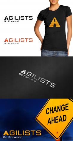
Here is my concept for your logo based on a highway (integrated in the letter "A") symbolizing "going forward" and referring to "THE way to go if one wants to pick up speed now and in the future on product design and delivery".
The design is clean, modern and suitable for online and offline media. It works great in full color and black&white;, at all sizes and on different backgrounds. The logo image can be used separately or integrated in the name. Your feedback (in Dutch or English) is welcome.
Please, don't forget to enlarge the image to see the actual colors and details.
Kind regards,
Lyra -
Ruyter says :
Het is een mooi concept, maar ik vind de letter A te veel afwijken van het hoofd font. Het maakt onrustig. Kan je daar nog wat aan 'tunen'?
-
This contest is finished. Its not possible to reply anymore.
-


