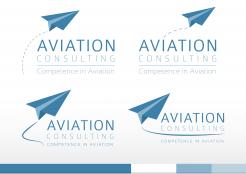
Aviation logo
Contest details:
Silver
- Contest holder: Baldauf
- Category: Logo design
- Total budget: € 329.00
- Start date : 02-02-2014 14:13
- Ending date : 16-02-2014 13:27
- Status : Ended
- Required formats: jpg,psd,ai,pdf
- Relevant files: None
-
Available languages:


- Number of designs: 217
-
Response rate:
low high
Needs:
Therefore the logo should communicate competence, be dynamic and easy to remember. In Addition a convincing name or Abbreviation could come with the logo.
Company description:
Aviation Consulting is an internationally operating one man Show with a loose Connection to one of the biggest aviation Consulting companies worldwide that means my services are frequently requested for special matters. My knowledge is based on many years of international experience as Airline Commander ,instructor and examiner in Europe, Russia , Asia and Canada also as Airline Manager and technical Consultant ( engineers degree). Additional I am accident investigator (USC)
Target group:
My customers are international Airlines, Maintenance organizations and Airports with problems in general management but especially in the operational planning, operations and control as well as process Setup and control, organization and strategy. Additionally Special knowledge for successful management of Airlines operations and Training of licenced Airline personnel is offered.
Colors, favourites and other requirements
the typical color for the aviation industry is blue in all shades combined with other Colors. I prefer technical symbols like ( parts of) engines, (modern) Cockpit layouts or instruments or other aircraft parts clearly identifyable.
JM
-
-
No comments
-
This contest is finished. Its not possible to reply anymore.
-
-
-
Description by designer JM:
Hello,
Thanks for the feedback on the first concept. I made some adjustments based upon your feedback. Some variations in which the logo has a slightly more dynamic touch. I showed options with a solid and a dashed line to symbolize the trails. O
f course, a lot of variations are possibly. Did i understand it correctly that the sentence "competence in Aviation" has to be part of the logo? Or are you planning to use it as a pay-off which doesn't have to part of the logo. I choose the first option, but here, but again.. a lot of variations are possible. I hope you like these new concepts. I stayed with the previous color scheme because i think it fits ideal to the line of business you will be involved in. That, combined with a strong message behind this logo('s) i think you can build a strong and unique identity.
All new feedback is welcome, don't hesitate to ask question as well!
Kind regards,
JM -
This contest is finished. Its not possible to reply anymore.
-
-
-
Baldauf says :
Yes you are completely right with the message ,I like the paperplane the shadowed Background of the first Picture and the small colored banner of the second one. Can you please integrate the words competence in Aviation. If you add also some lines behind ( like soft condensation trails) the aircraft showing movement would bring a bit more Dynamics .
Question : How would it look like if we move the plane to the left of the words ? Thank you rgds -
This contest is finished. Its not possible to reply anymore.
-
-
-
Description by designer JM:
Hello,
Hereby i present to you my first concepts for the logo for Aviation Consulting. To describe briefly what the idea behind this concept is: the paperplane symbolises the field of work you business is in, as well as the consulting business, but more also the airlines, airports organisations. I think this is a logo that would stand out because it's simplicity, it has a dynamic and positive feeling (reaching for the sky).
Also i presented the color scheme in which the visual identity could be build, based on the logo colors.
I would like to hear your feedback on this concepts.
Thanks in advance!
Kind regards,
JM -
This contest is finished. Its not possible to reply anymore.
-


