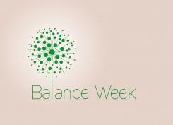
Balance week - Olis Retreats
Contest details:
- Contest holder: Antonellacaps
- Category: Logo design
- Total budget: € 160.00
- Start date : 14-09-2015 09:27
- Ending date : 28-09-2015 09:14
- Status : Ended
- Required formats: jpg,ai,pdf
- Relevant files: None
-
Available languages:

- Number of designs: 39
-
Response rate:
low high
Needs:
It will be called:
Balance Week
Logo will have a dandelion which will reminds also a tree and a mandala.
Simple elegant And inspirational
Company description:
Target group:
Colors, favourites and other requirements
logoman
-
-
No comments
-
This contest is finished. Its not possible to reply anymore.
-
-
-
logoman says
Hello,
hereby is a new one.
I think if the letter "L" doesn't touch the mandala it is more elegant.
It can be even nicer with some different shades of colors.
Let me know what you think
Best,
A -
Antonellacaps says :
Thanks
This is too much mandala And less dandelion And tree :)
I prefer Just one color -
This contest is finished. Its not possible to reply anymore.
-
-
-
logoman says
Hello,
hereby are logos with a mandala and the tree.
Let me know if you wish to see them in different colors and shapes.
Best,
A -
This contest is finished. Its not possible to reply anymore.
-
-
-
No comments
-
This contest is finished. Its not possible to reply anymore.
-
-
-
Antonellacaps says :
I like very much the 'L' like a tree, even if The logo has little of the mandala.
Remember: dandelion, tree And mandala inspiration.
I would put 'week' below 'balance'.
I would see even the chromatic scale. Thank You -
This contest is finished. Its not possible to reply anymore.
-

