Bioprocess Xcellence: modern logo for freelance engineer in the (bio)pharmaceutical industry
Contest details:
Bronze
- Contest holder: jeroenhoogakker
- Category: Logo design
- Total budget: € 229.00
- Start date : 04-12-2014 13:56
- Ending date : 14-12-2014 13:27
- Status : Ended
- Required formats: jpg,ai,pdf
- Relevant files: None
-
Available languages:


- Number of designs: 89
-
Response rate:
low high
Needs:
My company name is Bioprocess Xcellence.
Within my industry, most of my knowledge and experience is with purification (down stream processing) of the medicin. This might be used in the logo.
I like a modern, simple, straightforward design. I'm going to use the logo for my e-mail, business card, invoices and perhaps a simple website.
Company description:
Bioprocess Xcellence is a freelance company that helps the (bio)pharmaceutical industry, in cases of lack of knowledge or resources. The mentioned help is mostly the technical design and testing of process installations, and sometimes advise. Medicins are made and purified in these installations. Purification is where I have most expertise. The focus in this industry is on patient safety, although the client would also like to finish its projects (new/modified process instalallation) on time.
Target group:
Recruiters from intermediate companies (who have contact details and cv's of multiple freelancers); project leaders wishing to complete/fill up a team; heads of technology departments.
Colors, favourites and other requirements
Preference for a serious color, like blue or grey. Do no use to many different colors, please.
Roozz
-
-
Roozz says
Beste Jeroen,
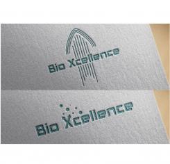
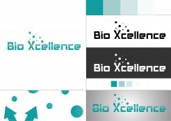
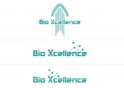
Hierbij mijn ontwerpen. Graag ontvang ik je feedback.
Grt. Roos -
jeroenhoogakker says :
Beste Roos,
op zich een mooi logo (vooral die met de kleine bolletjes/sterretjes vlakbij de X), maar vind het net niet serieus genoeg ogend voor mijn type dienstverlening.
Met vriendelijke groet, Jeroen -
This contest is finished. Its not possible to reply anymore.
-
-
-
No comments
-
This contest is finished. Its not possible to reply anymore.
-
-
-
No comments
-
This contest is finished. Its not possible to reply anymore.
-
-
-
jeroenhoogakker says :
Beste Roos,
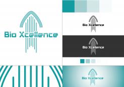
het derde logo lijkt me nog steeds het best, maar de pijltjes in de X en de bolletje lijken me wat te vrolijk.
Met vriendelijke groet, Jeroen -
This contest is finished. Its not possible to reply anymore.
-


