Challenge: Create a logo for a new interior design business!
Contest details:
Bronze
- Contest holder: 1323
- Category: Logo design
- Total budget: € 229.00
- Start date : 21-03-2014 16:09
- Ending date : 04-04-2014 15:54
- Status : Ended
- Required formats: jpg,psd,ai,pdf
- Relevant files: None
-
Available languages:


- Number of designs: 174
-
Response rate:
low high
Needs:
* Black and white
* Minimalistic
* 1323 has priority
* Amsterdam is second
* symmetric
* Do something with a stripe, connecting-sign (&) and if and circle
* No illustrations
Background info:
Starting business in interior design articles and advice
Two tough young blonde women from Amsterdam who love interior
Back to basic in terms of materials, natural
See enclosed document for inspiration!
Company description:
Target group:
Colors, favourites and other requirements
Pile et face
-
-
Description by designer Pile et face:
Hello, here's the re-work
-
This contest is finished. Its not possible to reply anymore.
-
-
-
Description by designer Pile et face:
Here it is!
-
1323 says :
Hi! Can you make another version of this logo with only a change in font? More like the Bauhaus font we saw online: http://www.logo-designer.co/wp-content/uploads/2012/11/100-tee-tea-corporate-logo-identity-design-german-minimalism-Bauhaus-graphics-packaging-2.jpg
Thanks! -
Pile et face says
No prob :) will post it tomorow
-
This contest is finished. Its not possible to reply anymore.
-
-
-
Description by designer Pile et face:
Hello. I'm a french designer but love Bauhaus minimalism.
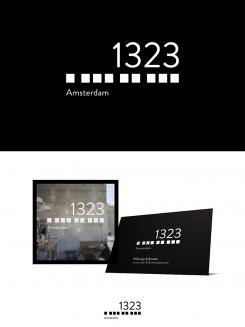
Here I used dashes as something that connects, as &. Of course one dash, then 3, then 2, then 3.
(BTW, you should google "Fronzoni" for your Pinterest ;) -
1323 says :
Hi!
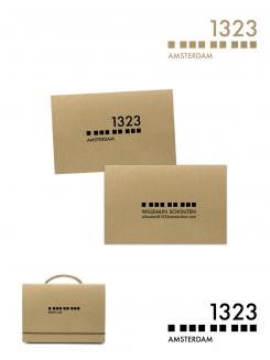
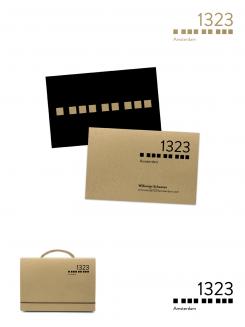
Thanks for the logo, we really like it! So hard to choose;). And thanks for the Fronzoni tip, beautiful!Can you make another version of this logo on a different background, more like a carton board color background? A natural color besides the black and white version. Thanks in advance!
Kind regards,
Maya & Willemijn -
This contest is finished. Its not possible to reply anymore.
-


