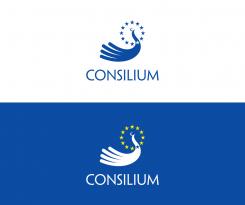
Community Contest: Create a new logo for the Council of the European Union
Contest details:
- Contest holder: Brandsupply
- Category: Logo design
- Total budget: € 250.00
- Start date : 08-08-2013 15:22
- Ending date : 30-09-2013 14:59
- Status : Ended
- Required formats: jpg,ai,pdf
- Relevant files: None
-
Available languages:

- Number of designs: 79
-
Response rate:
low high
Needs:
We suggested them to crowdsource the logo design and let everyone participate. However they went on with their procedure. That´s why we decided to start our own contest and invite the Brandsupply designer community to send in their creative logo proposals!
We cannot guarantee that the winning logo will be used by the Council. We initialize it to show that crowdsourcing designers can do at least as well as the big agencies. Maybe better. We will make sure that the contest and all the designs gets media attention. Even more so the winner. So take your chance to earn some more fame!
Please note: This is not the official contest of the European Council, but a contest run by Brandsupply.
Company description:
“The Council of the European Union (sometimes just called the Council) is the third of the seven institutions of the European Union (EU).” Says Wikipedia. And they are usually right. Of course much more useful information and also their current logo can be found there: http://en.wikipedia.org/wiki/Council_of_the_European_Union
note: The French and German translations of the briefing can be found in the attachemnts!
Target group:
Everybody (Sorry, we cant break it down much further ;-)
Colors, favourites and other requirements
Feel free to be creative.
lyra
-
-
Description by designer lyra:
Thank you for your feedback. I am glad you like it. My apology for the late reply.
While I would agree that the part of the logo ends with a swooshy shape, I don't agree with you entirely.
The part of my logo has a basic curved geometric shape which is integral part of the logo (i.e. the bird's head) and does not consist of a swoosh as an isolated element like the Nike logo.
I was inspired by crested birds (please check for example http://2.bp.blogspot.com/-8giutx7Nf4k/UQ5abk4cLqI/AAAAAAAAIXM/TdVnCxn9MJA/s1600/white+cockatoo+wallpaper+2013+02.jpg )
Their crest is "swooshy".
And why the bird's crest? Their crests are used to communicate with fellow members (of their species) and that is a part of the logo symbolism.
Although I prefer my original logo, here is the version with a different, C-shape crest, which stands for "Consilium". Your feedback is welcome.
Kind regards,
Lyra -
This contest is finished. Its not possible to reply anymore.
-
-
-
Description by designer lyra:
The logo is based upon a hand and a bird in flight: "...The EU is not only about peace among nations, it embodies, as a community of values, this vision of freedom and justice". (J.M.Barroso)
-
Brandsupply says :
Very nice, good idea. It kind of looks like the Nike swoosh in the middel, don't you agree? Perhaps you can edit that slightly?
-
Brandsupply says :
Very nice, good idea. It kind of looks like the Nike swoosh in the middel, don't you agree? Perhaps you can edit that slightly?
-
This contest is finished. Its not possible to reply anymore.
-


