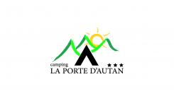
Creating a logo for a campig
Contest details:
Bronze
- Contest holder: laportedautan
- Category: Logo design
- Total budget: € 229.00
- Start date : 22-09-2015 21:05
- Ending date : 20-10-2015 20:56
- Status : Ended
- Required formats: jpg,psd,ai,pdf,gif
- Relevant files: None
-
Available languages:


- Number of designs: 193
-
Response rate:
low high
Needs:
We want the logo reflects our campsite: quiet, family, green, he does think of holidays
Company description:
We are a medium mountain campsite (500m altitude) in Cathar country (castle) It is a green campsite with plenty of shade tree and with a magnificent panoramic view of the plain Aude and Pyrenees. More information www.laportedautan.fr.
We are a "small" camping 78 pitches
Target group:
We welcome campers 0-77 years. In high season (July / August) we welcome many families of any nationality Dutch, Belgian, English (German, Spanish ....)
Colors, favourites and other requirements
Ignoring the designated website.
The background must be transparent for printing on colored sheets
We have no preference about colors, but we do not want a type logo camping waterfront.
We question whether the fact that the logo makes appear a "door" in any way it is to refer to the Porte d'Autan?
expert
-
-
laportedautan says :
Merci pour votre proposition.
dans l'idée, il y a des choses intéressante, mais le logo est à développer dans son ensemble. Soleil et tente a revoir totalement.
La couleur des montagnes, peuvent, je pense, être améliorer. -
This contest is finished. Its not possible to reply anymore.
-

