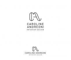
Creation of an elegant logo for a new company of interior design
Contest details:
Bronze
- Contest holder: Caroline Andreoni
- Category: Logo design
- Total budget: € 229.00
- Start date : 07-08-2014 12:35
- Ending date : 22-08-2014 12:22
- Status : Ended
- Required formats: jpg,psd,ai,pdf
- Relevant files: None
-
Available languages:


- Number of designs: 282
-
Response rate:
low high
Needs:
I think that it's can be good to work on initials C A besides the complete name of the company which bears Caroline ANDREONI's name
The logo will necessarily have to be able to come on:
- Our business(calling) cards
- Paper in makes dizzy
- Promotional leaflet
- Web site
Company description:
Caroline ANDREONI is a new company of design of inside which wishes to work on the high-end market.
We propose to our customers a wide outfit of services going of simple one advice color decoration in the renovation and the complete arrangement of an inside at a private individual, that for the professionals in restaurants, shops and hotels by emphasizing our creative and innovative ideas.
We position on the luxury market, down from range.
Target group:
- Rich international and French clientele.
- Well-to-do, upper upscale background
- Categories socio-professional: in +++
- Any age
- Clientele of private individual
- Clientele of professionals
Colors, favourites and other requirements
LOGO: colors, typos etc. necessarily have to reflect the nature of our company(society). They have to be very positionnantes, to evoke the elegance, the prestige, the luxury, the sharpness while being resolutely MODERN.
Stay in the simplicity, and the sobriety.
studioZ
-
-
Description by designer studioZ:
Last try...
-
This contest is finished. Its not possible to reply anymore.
-
-
-
Description by designer studioZ:
Here is a new idea in 3 variations.
-
This contest is finished. Its not possible to reply anymore.
-
-
-
Description by designer studioZ:
Thanks for your quick reaction. Here is another idea with a more elegant type.
-
Caroline Andreoni says :
Thank you but i think prefer the first version typo and the CA is not bad but nothing really spécial, it´s not yet very modern but i'm sure you can Will send me something i Will like it. May ne something really différent :)
-
This contest is finished. Its not possible to reply anymore.
-
-
-
Description by designer studioZ:
And here is a variation on the first one, can be used in black or outline.
-
Caroline Andreoni says :
Hello, i like the circule à round -
Caroline Andreoni says :
Ok iPad problem, i start again. I like the circle around the monogram but i'm ont sure to really like this CA. It's not bad at all but..
I like this typo bâton but have you got an other one à little similar but May be more élégant?
Thank you so much for your implication -
This contest is finished. Its not possible to reply anymore.
-
-
-
Description by designer studioZ:
Hi, here my first idea for your logo; it's very clean and simple with a professional look.
Please let me know what you think,
Connie -
This contest is finished. Its not possible to reply anymore.
-

