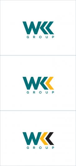
Design 4 logos for an international company
Contest details:
Bronze
- Contest holder: danny.vanderlinden@wkk.nl
- Category: Logo design
- Total budget: € 269.00
- Start date : 02-08-2018 12:08
- Ending date : 16-08-2018 00:00
- Status : Ended
- Required formats: ai
- Relevant files: None
-
Available languages:


- Number of designs: 74
-
Response rate:
low high
Needs:
We are positively surprised by the high quality and originality of the logo’s that have already been designed by you. For this reason we would be delighted if you also want to design 4 logos for our company.
Our company, called WKK, is a leading international wholesaler specialized in fixation materials. Our most important product groups are: cable ties, heat shrink tubing and cable glands.
Organization
The organization of WKK contains 3 different divisions, including several companies. Together they form the "WKK Group".
1. Division Fixation materials (cable ties, heat shrink tubing, cable glands, etc). For more information, see www.wkk.eu
- WKK Nederland B.V. (located in The Netherlands, head office, the Benelux market + the European countries where we are not active with a sales office)
- WKK GmbH (located in Germany, the German-speaking countries: Germany, Austria, Switzerland)
- WKK Italy s.r.l. (located in Italy, active in the Italian market)
- WKK Polska Sp. z o. o. (located in Poland, active in the Polish market)
2. Automotive division (fixation clips that are oftenly used in the automotive sector). For more information, see www.wkk-automotive.com
- WKK Automotive GmbH (located in Germany, active in the European market)
3. Energy division (cable accessories and special heat shrink tubing that is oftenly used in the energy sector), For more information, see www.wkk-energy.com
- WKK Energy GmbH (located in Germany, active in the European market)
Reason for approach
The reason why we approach you is the following. At the moment WKK has an outdated/ugly company logo (see attached file) which no longer fits with our current organization. Therefore we would like to have a new logo designed for the following divisions and the "WKK Group":
- WKK Group (it should be clear that this includes the 3 divisions: fixation materials, automotive and energy)
- WKK fixation materials
- WKK Automotive
- WKK Energy
The 2 directors/owners of WKK are (unfortunately still) very keen on the current logo. They are open to proposals for new logo’s, but do have the following requirements:
- The current corporate colors (PANTONE 322 C and black) must be maintained (because of recognisability). We also prefer to keep the corporate color PANTONE 1235 C which is used on our website(s) and in our catalogue(s).
- The pay off "Your Personal Connection", which is used in the WKK logo for the division fixation materials, may be removed or replaced by a new pay off. No pay offs are currently used in the logo’s of the automotive and energy division.
- The new logo’s should be easy to implement in the current corporate identity documents and websites (so not necessary to make changes to the current corporate identity).
The current corporate identity is retained. We do not want a completely new corporate identity. We only want new logo’s. To get an impression of our corporate identity you can view the websites mentioned above, our catalogue https://www.wkkgroup.co.uk/wp-content/uploads/sites/12/2018/06/Catalogue-WKK-Nederland.pdf and attached you can view the following files: business card, envelope and A4 letter paper.
Our vision on the new logo’s
The new logo’s must consist a figurative (trade)mark in combination with the company name. The logo’s should be wider horizontally than vertical (the logo’s are then easier to use).
We want to receive the logos as graphic files (Adobe Illustrator files/AI-files)
We hope the above information is clear for you. If you have any questions, please let us know.
Good luck!!!
Company description:
WKK is a leading importer and distributor that is specialized in fixation materials which offer a high quality solution for fixing, connecting, guiding and protecting cables for several industries. We serve customers throughout Europe from our office in The Netherlands, Germany, Italy and Poland.
Target group:
Customers and prospects (business-to-business) in the following market segments: electrical engineering, installation, automotive, energy, wholesale.
Colors, favourites and other requirements
Rusty_Saffir
-
-
No comments
-
This contest is finished. Its not possible to reply anymore.
-
-
-
Rusty_Saffir says
Signage and Print Presentation of your logo design for your visualization
-
This contest is finished. Its not possible to reply anymore.
-
-
-
Rusty_Saffir says
Hello Danny,
Good Evening!
Here is my updated design.
I was not able to extract or download icons for energy from your website as those images might be embedded in the webpage, hence I have used energy symbol.
Presented design on white and black background for your visualization -
danny.vanderlinden@wkk.nl says :
Dear Rusty,
This looks better. We prefer the design with the white background.
One question concerning the icon of WKK Fixation materials.
What's the icon on top of the square? We prefer the following order of range:
1. Cable tie on top (which is now in the middle)
2. Heat shrink tubing in the middle (which is now at the bottom)
3. Cable gland at the bottom (which is now on top?)
Can you change the order of rank please? Thanks.
Regards,
Danny -
Rusty_Saffir says
Hi Danny,
The icon on top is cable gland. I just increased the length of the gland to match the cable tie and heat shrink tubing.
Yes, will update the sequence of the icons in the square as per your suggestion tonight.
If anything else is needed do tell, so I shall update that at night once I start working.
Kind Regards,
Rusty -
danny.vanderlinden@wkk.nl says :
OK, thanks
-
This contest is finished. Its not possible to reply anymore.
-
-
-
danny.vanderlinden@wkk.nl says :
Dear Rusty,
Thank you for the modified design. However, we have a few comments:
- The 2 "K"'s in the text "WKK" look very nice, but these are difficult to read. Can you place "normal" K's in a similar font? Can you make the 2 "K"'s light green?
- Please remove the "TM"-icon.
- In the orange texts, please use "closed" A's
- Please remove the cable icon (3rd icon from left) in the logo of WKK Fixation materials
- Please replace the automotive icon by a car silhouette
- Please replace the energy icons in the green stroke by the icons that are used on top of the WKK Energy website (www.wkk-energy.com)
Looking forward for your new design proposal. -
This contest is finished. Its not possible to reply anymore.
-
-
-
danny.vanderlinden@wkk.nl says :
Dear Rusty,
Thank you for your designs. We like the total green one and the one with only the color orange in it.
We have 1 positive comment. Can you add a trade mark (icon) per WKK company (WKK Fixation materials, WKK Automotive, WKK Energy, WKK Group)?
Looking forward for your new designs.
Regards,
Danny -
This contest is finished. Its not possible to reply anymore.
-

