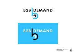
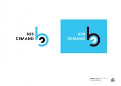
design a business2business marketing service provider logo
Contest details:
Bronze
- Contest holder: Akalkman
- Category: Logo design
- Total budget: € 199.00
- Start date : 23-06-2013 14:37
- Ending date : 21-07-2013 14:37
- Status : Ended
- Required formats: jpg,psd,gif
- Relevant files: None
-
Available languages:


- Number of designs: 70
-
Response rate:
low high
Needs:
Also looking for a website design, later perhaps. If logo is satisfactory. Offering a good logo plus capabilities to do web gives higher preference for choosing.
Company description:
Target group:
Colors, favourites and other requirements
DutchDesigners
-
-
Description by designer DutchDesigners:
Nieuwe versie met duidelijker naam.
-
This contest is finished. Its not possible to reply anymore.
-
-
-
Description by designer DutchDesigners:
I am also a web designer, see my online portfolio at www.annekeauer.com
-
Akalkman says :
thanks (dank!) for your fast entry. i carefully reviewed it. i like the inner circle where things get integrated and looped. on the other hand, i would like to see a bit more bold and simplicity. now the attention is drawn to the b and the name seems disconnected. hope this helps and explains why i am not yet choosing your design. alexander
-
DutchDesigners says
Dank! for the review. Your remarks are clear. I'll break my head about the ajustments and will enter a new design in the coming days. So bear with me... Groeten, Anneke
-
bahador.shirazian says
Nice adaptation of b2b inside each other. My opinion if you add another b (lighter color) behind the main one and move the text to the from of the b, akalkman will be more pleased. Sorry for interrupting you discussion...just couldn't wait and see your broken hand ;)
-
This contest is finished. Its not possible to reply anymore.
-


