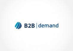
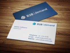
design a business2business marketing service provider logo
Contest details:
Bronze
- Contest holder: Akalkman
- Category: Logo design
- Total budget: € 199.00
- Start date : 23-06-2013 14:37
- Ending date : 21-07-2013 14:37
- Status : Ended
- Required formats: jpg,psd,gif
- Relevant files: None
-
Available languages:


- Number of designs: 70
-
Response rate:
low high
Needs:
Also looking for a website design, later perhaps. If logo is satisfactory. Offering a good logo plus capabilities to do web gives higher preference for choosing.
Company description:
Target group:
Colors, favourites and other requirements
Brandbrains
-
-
Description by designer Brandbrains:
We have changed the 'globe'. The icon refers now more to two elemens that come together: business 2 business. The elements are shaped that way, they should associate with service.
-
Brandbrains says
We gladly want to know what your opinion is :)
-
This contest is finished. Its not possible to reply anymore.
-
-
-
Akalkman says :
Simple design, I like. Although i like the symbol. Can you explain the idea behind the symbol?
-
Brandbrains says
As you explained, your company acts international. I favor of that we decided to take the world (globe) as an expression of your services, in a fluid way (the seperations in the globe). The globe refers to movement, innovation and development. In combination with the blue colors we find the logo professional, catchy and trustworthy.
Do you have any suggestions or what so ever? -
Akalkman says :
we do act international (europe) , but not global. so that would overpromise. do you see options?
-
This contest is finished. Its not possible to reply anymore.
-
-
-
Akalkman says :
see other comments .
-
This contest is finished. Its not possible to reply anymore.
-


