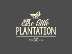
Design a clean and trendy logo for new vegan/vegetarian blog and website
Contest details:
- Contest holder: venusinblack
- Category: Logo design
- Total budget: € 150.00
- Start date : 27-02-2014 21:58
- Ending date : 11-03-2014 18:44
- Status : Ended
- Required formats: jpg,ai,pdf
- Relevant files: None
-
Available languages:

- Number of designs: 84
-
Response rate:
low high
Needs:
The logo needs to be
- easily readable
- trendy but not pretentious
- simple
- ideally using no more than 3 colours, including dark grey as a background (think writing on a blackboard/stamp/distressed/vintage)
- logo should work well as top of a website and banner above a cafe
- the logo should communicate elegance and simplicity and is aimed mainly at affluent women in their 20's, 30's and 40's, although not too girly please
we are looking for 2 logos - 1 the main banner ( payment 100Euros)
+
an abbreviated logo i.e. just taking the main initials of the main logo OR using just a symbol from the main logo (payment 50euros)
Company description:
The Little Plantation is a food blog/cafe that serves vegetarian food, juices, coffee and vegan treats
Target group:
Mainly middle class women in the 20-50 but logo should appeal to as broad a market as possible
Colors, favourites and other requirements
I am open to lots of ideas BUT in my mind the logo is:
dark grey (or very dark green/grey)! background
Writing:
contrasting colour
i.e. bright or pastel yellow
off white/white
pastel purple
pastel green or blue
It needs to be clear that this is a logo for a food/drink/vegetarian site NOT a gardening site
Kate
-
-
Kate says
Hi,
Here are a few more colours. I've omitted some frills, worked on legibility and replaced the knife. As you can see, I haven't adapted the N's yet. I can still do that later if you prefer a certain design. I look forward to hearing what you think. -
venusinblack says :
Great. Love the top two and also the bottom right blue one. Works super well:)
-
This contest is finished. Its not possible to reply anymore.
-
-
-
Kate says
Here's another variation, a little more inspired by the Jack Daniel's logo.
-
venusinblack says :
I just LOVE all these designs.
I think the corrected N in your second design appeals to me more. Also like the font being a bit thicker. Love the simplicity of your first and second design. Only changed suggestions for those would be - can I have a spoon rather than knife. AND - more importantly, worried the pink is too girly. Blue perhaps for the bowl or green OR a different pink (think more letters in Hummingbird bakery). Also wonder if stripes on the (blue) bowl will make it a tad more gender neutral? But this design very much in my top 3. :) -
venusinblack says :
As for the new Jack Daniels inspired design. I am SO drawn to this. LOVE it! Hoping the different colour will make it more gender neutral. Plus I am a bit worried the swirly bits are too feminine. But I do love it, so it's a tough one. Does remind me a bit of a tatoo design:). Great.
Seeing it like this has also helped me clarify - web/blog will be white background. Cafe will be dark and for facebook profile pic I'd just use the bowl with a dark background. So love how versatile this design is. 3 birds with one stone so to speak.
So my only sticking point would be the colour of the bowl as it's also not as clearly visible against the white background.
Thanks again for this:) -
This contest is finished. Its not possible to reply anymore.
-
-
-
Kate says
Hi, thanks for the feedback. Is this what you had in mind?
-
This contest is finished. Its not possible to reply anymore.
-
-
-
venusinblack says :
Kate, this is SOOO beautiful:)
I don't know what else to say!
the N looks a bit awkward and perhaps font a hint thicker, but apart from that FAB!
-
This contest is finished. Its not possible to reply anymore.
-
-
-
venusinblack says :
Thanks so much for this. I really like how you distressed this and also that you used the bowl. Works well.
-
This contest is finished. Its not possible to reply anymore.
-

