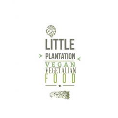
Design a clean and trendy logo for new vegan/vegetarian blog and website
Contest details:
- Contest holder: venusinblack
- Category: Logo design
- Total budget: € 150.00
- Start date : 27-02-2014 21:58
- Ending date : 11-03-2014 18:44
- Status : Ended
- Required formats: jpg,ai,pdf
- Relevant files: None
-
Available languages:

- Number of designs: 84
-
Response rate:
low high
Needs:
The logo needs to be
- easily readable
- trendy but not pretentious
- simple
- ideally using no more than 3 colours, including dark grey as a background (think writing on a blackboard/stamp/distressed/vintage)
- logo should work well as top of a website and banner above a cafe
- the logo should communicate elegance and simplicity and is aimed mainly at affluent women in their 20's, 30's and 40's, although not too girly please
we are looking for 2 logos - 1 the main banner ( payment 100Euros)
+
an abbreviated logo i.e. just taking the main initials of the main logo OR using just a symbol from the main logo (payment 50euros)
Company description:
The Little Plantation is a food blog/cafe that serves vegetarian food, juices, coffee and vegan treats
Target group:
Mainly middle class women in the 20-50 but logo should appeal to as broad a market as possible
Colors, favourites and other requirements
I am open to lots of ideas BUT in my mind the logo is:
dark grey (or very dark green/grey)! background
Writing:
contrasting colour
i.e. bright or pastel yellow
off white/white
pastel purple
pastel green or blue
It needs to be clear that this is a logo for a food/drink/vegetarian site NOT a gardening site
Soy
-
-
No comments
-
This contest is finished. Its not possible to reply anymore.
-
-
-
venusinblack says :
Hi there, as a design per se it is GREAT and so close to my original brief.
I think though that a linear design will just work better as a heading for my website/blog and above the cafe. But thanks so much for this inspiring design:) -
This contest is finished. Its not possible to reply anymore.
-
-
-
No comments
-
This contest is finished. Its not possible to reply anymore.
-
-
-
venusinblack says :
This is the best of your designs. Thank you
-
Soy says
Thank you so much. If you have suggestions, Tell me if you want that i change somethings . Cordially
-
This contest is finished. Its not possible to reply anymore.
-
-
-
No comments
-
This contest is finished. Its not possible to reply anymore.
-
-
-
venusinblack says :
These are nice, but I think I prefer the layout of the previous design. I like the little ribbon at the bottom.
-
Soy says
ok ! do you wan i let him as it was or should I make changes?
-
venusinblack says :
I would be so grateful if you could take the previous design, soften it and make the little corrections. Many thanks for your hard work.
-
Soy says
Thank you so much and sorry for my bad english :) tell me what kind of corrections should I bring .
-
Soy says
is that the letters you like or do I resume the previous?...
-
This contest is finished. Its not possible to reply anymore.
-
-
-
venusinblack says :
I really like this and feel that - with one of the previous designs - it is most closely matched to what I envisaged in my mind when I set the brief. So thanks for understanding the concept.
A few things to make it better - date is 2014, also, can we 'distress' the letters and make it a bit softer and more vintage? I also don't want it to say Web and coffee. I may or may not in future have a tag line on the bottom but for now I want the image to speak for itself and don't want too many words to need to explain what it is. So perhaps date in the banner instead? Also - instead of vegetarian food at the top, can you just write 'the' in that writing. Thanks so much, really like this:) -
Soy says
Hello. Thank you for your comment.Ok! I make the changes and present it soon.
-
venusinblack says :
So instead of - vegetarian food, please write THE
instead of web and coffe perhaps place the sicne 2014 in the ribbon
when I say soften I mena - colour slightly softer colours. when I mean distress think little white patches o the font and/or font a hint more feminine. I am not a designer but that's what I feel, a bit more vintage..I hope this helps -
This contest is finished. Its not possible to reply anymore.
-
-
-
Description by designer Soy:
Hello, Here is a first proposal. I am at your disposal for your comments and suggestions. Good luck with your project. Cordially.
-
venusinblack says :
So cool - this is So NOT what I had in mind, but works really well. I love the soft grey colour you chose, it makes it feminine (my target group) without being in your face about it. The veggies are too big for me though and make the design an inch too busy. Please can you include the word THE. Thanks again:)
-
This contest is finished. Its not possible to reply anymore.
-

