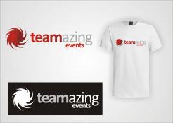
Design a logo for a dynamic event agency
Contest details:
Silver
- Contest holder: Teamazing
- Category: Logo design
- Total budget: € 329.00
- Start date : 26-04-2014 14:50
- Ending date : 10-05-2014 14:45
- Status : Ended
- Required formats: jpg,psd,ai,pdf
- Relevant files: None
-
Available languages:


- Number of designs: 164
-
Response rate:
low high
Needs:
The logo should communicate:
Team spirit,
Joy and pleasure in participating in exciting events,
Entertainment, Fun, Motivation, Leisure,
modern, creative, inspiring and extraordinary events,
adventure-events, experience-driven society, event agency
Company description:
A young and dynamic company plans and organises special events. The first major event of the company is a scavenger hunt through the city center of Graz, Austria. We want to create a image of adventure and creativity for this event series. During the event in addition to the unique experience of the participants, increased attention is paid to the teambuilding effect. Therefore, companies are addressed to do a eventful adventure tour with their employees. In the near future other events will be implemented in the companies array of events, such as a for students or tourists designed scavenger hunt through the night or gastronomy scene of Graz.
The basic idea that challenging tasks have to be solved in team, is always on top!
Target group:
Small and medium-sized businesses;
Individual departments and teams of companies;
People who enjoy new, exciting and contemporary events, Students, groups of friends, etc.
Characteristics of the target group:
Adventurous,
Enthusiastic,
Open to new ideas,
Communicative.
Colors, favourites and other requirements
Basically, no guidelines.
We want to connect the "Teamazing"-logo with the event names, like: "Teamazing" and overhead/below/sideways "Name of the event".
It would be great, if the logo is round or square for perfect use on facebook & Co. But this is not a must, more importantly is, that the logo can be read from far away.
vrveljkoradovic
-
-
Teamazing says :
Dear vonvrveljkoradovic!
Thank you for your designs!
We really like your lettering and the colours. Somehow the icon looks like a octopus, maybe you find a better icon for our company. -
This contest is finished. Its not possible to reply anymore.
-
-
-
Teamazing says :
We like the "t", but due to it´s in the background, it disturbs the lettering. From further away it is not legible. We also like the colours and the font of the lettering!
-
This contest is finished. Its not possible to reply anymore.
-
-
-
Teamazing says :
Unfortunately, this logo looks too similar to the one of facebook.
-
This contest is finished. Its not possible to reply anymore.
-
-
-
Teamazing says :
In this design we have similar concerns as in the latter. We like the "background-thing" but maybe try it a little more transparent and with a "T".
-
This contest is finished. Its not possible to reply anymore.
-
-
-
Teamazing says :
Unfortunately we can´t identify with the icon in the "a" and if we use a green, it has to be a fresh, modern and cheeky green. But we think it is a good idea to put the symbol into the letters.
-
This contest is finished. Its not possible to reply anymore.
-
-
-
Teamazing says :
Also this icon does not fit to our company, but we like the coloring.
-
This contest is finished. Its not possible to reply anymore.
-
-
-
No comments
-
This contest is finished. Its not possible to reply anymore.
-
-
-
Teamazing says :
We like the background of the "e", but it´s a little bit too sporty and we definitely like the coloring.
-
This contest is finished. Its not possible to reply anymore.
-
-
-
Teamazing says :
The icon is good, but maybe not perfect for our company. We are looking for a icon for our exciting and inspiring events for "Businesspeople" and enterprising people.
-
This contest is finished. Its not possible to reply anymore.
-

