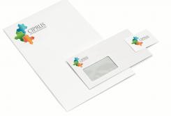
Design a logo for a medical scientific research study!
Contest details:
Bronze
- Contest holder: katesitnikova
- Category: Logo design
- Total budget: € 229.00
- Start date : 01-08-2014 15:49
- Ending date : 21-08-2014 12:41
- Status : Ended
- Required formats: jpg,ai,pdf
- Relevant files: None
-
Available languages:


- Number of designs: 97
-
Response rate:
low high
Needs:
The logo will be used on letters and questionnaires sent to participants. As participants will receive these repeatedly during a period of 1 year, it would be nice if the logo had high recognisability. The logo will also be used in letters sent to doctors and nurses.
The study is called CIPRUS, which should be the main component of the logo. The title CIPRUS doesn't have a particular meaning in our study, it is simply an abbreviation of the longer name of the study (Cognitive-behavioural Intervention in Primary care aimed at Reducing Undifferentiated Somatoform disorder).
Company description:
The research is conducted by VUmc, a large academic medical centre in the Netherlands. Therefore, we are looking for a professional feel to the logo, but not too "hospital"-like.
Target group:
Participants in the study (adults of 18-75 years old with unexplained physical complaints), treating physicians and nurse-practitioners.
Colors, favourites and other requirements
The title CIPRUS has to be in the logo. It should be easy to read and in colour, although it's important that the logo still looks good if printed out in black & white.
If possible, our preference goes out to 2 designs: 1 with only the name CIPRUS and 1 with the name CIPRUS and the extended name below (Cognitive-behavioural Intervention in Primary care for Undifferentiated Somatoform disorder).
Bos.Elisabeth
-
-
No comments
-
This contest is finished. Its not possible to reply anymore.
-
-
-
No comments
-
This contest is finished. Its not possible to reply anymore.
-
-
-
No comments
-
This contest is finished. Its not possible to reply anymore.
-
-
-
Description by designer Bos.Elisabeth:
The logo represent a puzzle and at the same time an active human-figure. With this, I tried to catch the idea behind this research in an image. Trying to solve the puzzle of these people, to make them balanced and active again.
-
katesitnikova says :
Thanks for your design! Really like the idea of the puzzle pieces, it definitely captures the idea of the study. Like the bright colors a lot and because of the puzzle pieces the logo still looks interesting in black & white.
-
This contest is finished. Its not possible to reply anymore.
-


