Design a logo for a start-up against food wasting !
Contest details:
Bronze
- Contest holder: raodath
- Category: Logo design
- Total budget: € 199.00
- Start date : 20-01-2014 22:57
- Ending date : 05-02-2014 22:41
- Status : Ended
- Required formats: jpg,psd,ai,pdf;png
- Relevant files: None
-
Available languages:

- Number of designs: 69
-
Response rate:
low high
Needs:
Our company name "Panier futé" stands for "smart basket" or "smart cart".
We would like to use the Logo for all our communication.
Cf attached file for a french version of our scope.
Thanks
Company description:
Target group:
Our target groups are essentially the households wishing to save money, students with few ressources and people who are interesting in saving the planet.
Cf attached file for a french version of our scope.
Colors, favourites and other requirements
We were thinking about green and blue as colors,a basket image should also be insered somewhere... but we are opened to any suggestions.
Cf attached file for a french version of our scope.
krisi
-
-
No comments
-
This contest is finished. Its not possible to reply anymore.
-
-
-
No comments
-
This contest is finished. Its not possible to reply anymore.
-
-
-
No comments
-
This contest is finished. Its not possible to reply anymore.
-
-
-
krisi says
I think this option is very well
-
raodath says :
Thanks krisi.
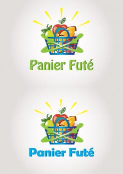
This green basket definetly reminds me a groceries basket. So that's a good point. Can you reduce the size of the bread and the red apple? I think there are enormous compare to the basket size.
Regarding the font color for Panier Futé, i'm not really convinced.I doesn't fit the all design because we don't have any blue inside the basket.
What about the leaf on the e in Futé. I think we should keep that distinction.
Thanks for your effort krisi -
This contest is finished. Its not possible to reply anymore.
-
-
-
raodath says :
I think the design 3 is more esthetic. It simple not too loaded. Same remarks:
I think you should reduce the size of the bread and the red apple. And also the supérieur outline of the leaf is to high, can you incurve it a little bit?
Also, can you put a leaf on the e in Futé?
I prefer the font on your last design , but same remark the color doesn't fit with the whole design.
Thanks -
This contest is finished. Its not possible to reply anymore.
-
-
-
krisi says
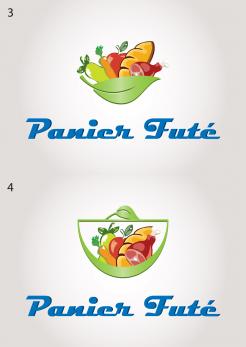
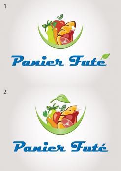
I make 4 different combination with arc and leaf. I think the result is interesting. I expect your opinion. I put numbers to be easier to tell me which design you prefer.
-
This contest is finished. Its not possible to reply anymore.
-
-
-
krisi says
Here I just got the idea for an interesting way of writing the name, so I decide to show you. just a idea
-
raodath says :
I like it but i remind me a tea logo.
Can you try it with the same idea with the arc as mentioned before.
Thanks. -
This contest is finished. Its not possible to reply anymore.
-
-
-
krisi says
Hello. I make some changes. I hope you will like it. I think this font is better and I put this arc to look like more complete. If you have more ideas to make it better I am open to hear them.
-
raodath says :
The font is really better.
I like the arc idea. It makes me think about the bottom of a basket. So i'm thinking what if we remove the blue basket and directly place the foodstuffs in the arc.
Can you try it?
Thanks -
raodath says :
Krisi,
What do you think about using a leaf instead of the basket's handle to complete the basket designed with the arc?
-
This contest is finished. Its not possible to reply anymore.
-
-
-
raodath says :
Thanks krisi. I really appreciate the precision inside the design of your foodstuffs.
But one thing is still bothering me. The arrows. I thing it's still to loaded.
Can you imagine something more simple to convert the green message?
Thanks -
raodath says :
I'm also not really convinced by the yellow design upon the basket...
Regarding the font, can you use something less classic like mikidejanovic or rpdesign used. -
This contest is finished. Its not possible to reply anymore.
-
-
-
raodath says :
Thanks for the new proposition. I think the arrows are too big here. We don't really get what are inside the basket. Can you reduce them or make the basket bigger?
-
This contest is finished. Its not possible to reply anymore.
-
-
-
raodath says :
Thanks krisi for your submission. It's a good start. Can you insert some foodstuffs insude the basket like vegetables, meat, bread, milk for example?
Can you think about a better font for "Panier futé". This one is too basic i think.
Thanks -
This contest is finished. Its not possible to reply anymore.
-

