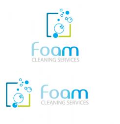
Design a logo for a (starting) cleaning company that emits professionalism, reliance and trust.
Contest details:
Bronze
- Contest holder: FCS.Roh
- Category: Logo design
- Total budget: € 229.00
- Start date : 04-05-2015 16:06
- Ending date : 18-05-2015 16:04
- Status : Ended
- Required formats: jpg,ai,pdf
- Relevant files: None
-
Available languages:


- Number of designs: 99
-
Response rate:
low high
Needs:
Company description:
Company name: Foam Cleaning Services
Website: foamcleaning.nl
Foam Cleaning Services is a cleaning company, who focuses on all facets of the cleaning business. From offices and schools to public entries (apartments) and graffiti removal.
Target group:
Company's and schools
Colors, favourites and other requirements
We think of the following: Blue shades and Grey shades.
But we also love surprises.
selenia
-
-
FCS.Roh says :
Selenia,
Thank you for the design. The bubbles look fine. But we are still ambivalent about the font.
Today we won't be able to comment on the new designs. As soon we are able to comment we will get back to you.
Thank you -
selenia says
thanks for the rating and comments!
-
This contest is finished. Its not possible to reply anymore.
-
-
-
selenia says
like that?
-
selenia says
? ^^
-
FCS.Roh says :
Selenia,
This design comes much closer to our vision than the previous. We think that the bubbles would look better in a light shade of blue, instead of grey. Also we aren't sold on the font.
It just doesn't stand out (without standing out).
Also the illustration could stand a bit closer to the name.
We certainly like the way this is evolving.
Thank you.
-
This contest is finished. Its not possible to reply anymore.
-
-
-
selenia says
Thank you for your comments!
Here's the updated design.
best regards
selenia
-
FCS.Roh says :
Hi Selenia,
We like the 2nd design. Maybe you could use a darker shade of blue for the name and we don't know about the accents in the O and A. For the illustration maybe you could use different shades of blue (dark, darker, darkest) and use the grey (but maybe not as a primary color for the frame).
Thank you for the designs and we hope that you'll give it another go. -
selenia says
Yes, I will make the change.thanks!
-
This contest is finished. Its not possible to reply anymore.
-
-
-
selenia says
Hi, here is my idea for your logo.
I would like to hear your opinion.Click on the image for better resolution and view!
Kind regards,
selenia -
FCS.Roh says :
Hi Selenia,
We have to say that we like where you're going with this. The bubbles do have a certain charm, but maybe you could make an illustration with foam, or something more abstract. Also try a different color combination.
Also the way the color builds up from the F to M is something we're ambivalent about. Maybe begin the sequence with more color or make it one color.
I hope the comments are clear and you will give it a go.
Thanks again for this design.
-
selenia says
Yes, I will make the change.thanks!
-
This contest is finished. Its not possible to reply anymore.
-

