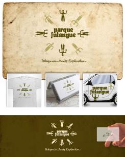
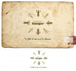
Design a logo for a unique nature park in Chilean Patagonia. The name is Parque Futangue
Contest details:
- Contest holder: matiasrt
- Category: Logo design
- Total budget: € 600.00
- Start date : 11-06-2013 23:11
- Ending date : 10-07-2013 22:55
- Status : Ended
- Required formats: jpg,ai,pdf
- Relevant files: None
-
Available languages:

- Number of designs: 259
-
Response rate:
low high
Needs:
16 years ago, we started developing an amazing trail network on this land once impenetrable. Today, more than 70 miles of high standard trails provide the visitor with access to breathtaking views of the Patagonian Andes and a variety of natural attractions you could only see in a place that has remained untouched.
Our approach to tourism development is one that rigorously cares environmental protection, supports the local community and creates a profitable sustainable business, offering good jobs, better quality of life and a world-class experience for visitors.
We conceive the park as an exploration playground where the possible activities are countless: hiking, fly fishing, rock climbing, kayaking, biking, horse riding, bird watching, snowshoeing, bathing in natural hot springs and soaking up the local culture are some of them.
Futangue Park presents a unique opportunity, a place with its own identity where natural phenomenons develop and extend in all sectors of the park. The extension and diversity of ecosystems invites visitors to explore, walk and contemplate moving scenery.
We need a logo that contains the name “Parque Futangue” and an image, shape, figure or symbol that represents the park. Parque is the Spanish translation for park and Futangue means great valley, written in the native language of the Huilliches, millenary people from southern Chile.
The typography and the logo should reflect a sense of exploration, purity, adventure and movement; it should make future tourists want to discover this place; it must be attractive as the park itself; it has to communicate the values of nature and balance of a place where time fades away while you are out there exploring, taking pictures, learning or just enjoying life.
We would like to use the logo for all our communications (website, press notes, leaflets, merchandising, etc.)
Good luck!
Company description:
This is a rainforest conservancy project that plans to become a sustainable touristic destination for nature lovers and adventurers from all over the world.
Target group:
Tourists who like authentic outdoor experiences and are willing to pay more for a comfortable and safe service.
People who love nature and value being in pristine places, away from the crowds.
Colors, favourites and other requirements
Creator
-
-
Description by designer Creator:
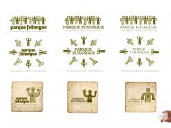
I gave the "pillans" more character. 3 type versions. I wish you luck ;-)
-
matiasrt says :
thanks!!
-
matiasrt says :
Hi Ted !,
For the moment , i like the typography in the left side, with the arrangement you made to the letter "U".The slogan is ok that way.
I would like you to display the gods the same way you draw them before in your previous submission (I dont know yet which of these with "character" i prefer, so just keep the old ones and have this new as an option.
Finally, i want to have the two versions, the round one and the gods on a line. -
matiasrt says :
sorry !! i mean the typography in the right side
-
Creator says
Hi Matías,
Thank you! Offcourse You will get what you want :-) on a line, round. And with The characters you like, or think would be best representive for your parc. Nice! Have some nice days, we keep in touch.
Salud,
Ted -
This contest is finished. Its not possible to reply anymore.
-
-
-
matiasrt says :
Hi Ted,
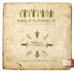
In the logo with the gods on a line i prefer if you turn the one with the head down.
The themes are ok.
I´m ok with this typography but i would like you to change a little bit the letter "Q" and the letter "U" to make them more readable and easy to notice. I´m afraid that someone confuse the "U" with a "V" or doesnt undersatand the "Q".
Finally, what if you try with different typography for "Patagonian Andes Exploration" to avoid abusing of just one type. -
matiasrt says :
another small detail: the god with the moon should have her arms up, and in the round logo the god with the sun should be the one at the top
-
matiasrt says :
I still would like to see the advert typography as well
-
This contest is finished. Its not possible to reply anymore.
-
-
-
Description by designer Creator:
Hola Matías,
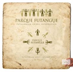
My updates.
Buenos Dias (Nuchos a qui) -
matiasrt says :
Ok cool , I will ask for a second opinion. In the meantime is it possible to see the logo with the ADVERT typography or another one similar? thanks
-
This contest is finished. Its not possible to reply anymore.
-
-
-
Creator says
Hi Matías
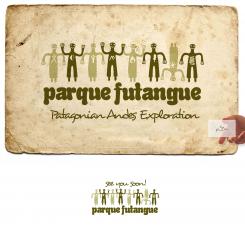
This proposal is with the Advert type... -
This contest is finished. Its not possible to reply anymore.
-
-
-
Description by designer Creator:
Hola Matías,
My update. Looking forward...
Saludos,
Ted -
matiasrt says :
Hola Ted. I like the idea of themes, is very good. We will just have to agree on which are the best to put. I´m ok with the sun, the moon, the mountains, and the tree, but the others are not sufficiently clear for me. Let me see if the new typography is ok for the people i work with.
Good job ! -
matiasrt says :
can you try with a more mature, sober and elegant typography,one that makes you feel that the park is exclusive
-
matiasrt says :
other thing that is worth trying , is to make a curve with park on the top and the same with Futangue in the bottom. I believe you if you think it wont look ok that way
-
matiasrt says :
regarding to the themes: the sun must be on a male figure, the moon must be on a female figure. I dont understand the theme on the figure pointing to the northwest, you could use a simple frog on that one. The figure pointing to the south isn´t clear either,you could put something that simbolize fire and finally the one pointing to the southwest, i guessthe theme represents a person, maybe you could put it like a hiker or just use the band on the chest like in the original figure.
-
Creator says
Hi Matías,,
From left to Right: vulcano, moon with stars, frog hand, mountain, fire, leaf, sun and last 'river'. Offcourse minor changes can be made... for now i think its enough. Unfortunatly for me you made my idea public by making it an logo requirement... so i lost my 'advantage'. I understand from your point of view. Obvious. I will make it just The way you want it if you like it that much. Now i wait and see...
Salud,
Ted -
This contest is finished. Its not possible to reply anymore.
-
-
-
matiasrt says :
Hi, interesting logo !!. Give me your email to send you the image I need in the logo, you will just have to do a cool adaptation, and you wont have to spend time with the concept , i got it already. By the way the slogan would be " Patagonian Andes Exploration".
Thanks for participating !! -
matiasrt says :
hey, this one is definitely an option with minor arrangements. I just need you to explore some other options, that´s why i need to send you some images!
-
Creator says
Thank you! I'll send you my mailadres in the direct system.
-
matiasrt says :
Hi Ted,
Can I see this one with different typography and with the slogan "Patagonian Andes Exploration" -
This contest is finished. Its not possible to reply anymore.
-

