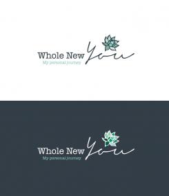
Design a logo for my blog, Whole New You
Contest details:
- Contest holder: wnyblog
- Category: Logo design
- Total budget: € 100.00
- Start date : 27-11-2015 20:05
- Ending date : 04-12-2015 19:55
- Status : Ended
- Required formats: jpg,psd,ai,pdf
- Relevant files: None
-
Available languages:


- Number of designs: 88
-
Response rate:
low high
Needs:
I want to focus on the balance between wholesome foods, and physical- and emotional strength, and how you can achieve this balance through mindful living (e.g. yoga, meditation). I have found this ‘holy trinity’ to be the key to optimal health in today’s world.
I feel very excited to share my experiences, tips, and explorations, since – as a result of illness followed by burnout - I have personally experienced what it’s like to feel desperate for improvement whilst not knowing how to make progress or recover.
Having said that, I consider the blog as a positive result of my experience, a chance to create a platform to exchange ideas with people in similar situations worldwide, or anyone generally seeking to improve their health. The focus will be on the powerful transition that may take effect once you become aware of the right tools to get going.
My goal is to reach a large audience, but since I’m just starting up my budget is still limited. I would be very grateful if anyone can help me out ☺.
Company description:
I'm setting up a new blog called Whole New You.
Target group:
Everyone (both young professionals as generally anyone who seeks to improve their health) interested in and/or seeking for tips or advice to improve their physical, mental and emotional health and well-being. Individuals who want to feel whole - energised, happy and healthy - and whose goal is to become the best version of themselves and enjoy life to the fullest.
The logo may have a more elegant or 'feminine' appearance but it's important that it appeals to a large audience, including men.
Colors, favourites and other requirements
To give you an impression of the look and feel of my blog I’ve created a moodboard and added some examples of fonts I’d like to use for my website. Please use this for your reference when creating the logo.
The tone of voice I will use in my writings will be optimistic, and focus on the positive benefits of the health journey: I’d like to see this reflected in the logo. I like a clean and light style, which uses the colors of the moodboard and which appeals to a large audience. The name of the blog (Whole New You) must be part of the logo, the pay-off (“Food for thought for a healthy, energized and thriving life”) can be included optionally (I realise it's quite lengthy, so I'm open to designs in and excluding it). An object may be used if you feel it adds value, but is not a prerequisite.
Keywords: original, transformative, energising, thriving, positivity, optimism, (re)gaining balance, (w)holistic health and living, self-challenge & -development, self-care, enjoying life to the fullest.
More specifically: yoga, meditation, mindfulness, wholesome and nutritious foods, travel, cultural values, nature, photography, sports.
Y-graphic design
-
-
Y-graphic design says
Thanks for rating!
-
Y-graphic design says
Thanks! I'm very exited!
-
This contest is finished. Its not possible to reply anymore.
-
-
-
wnyblog says :
Thanks again for your efforts. I think I should give some more guidance if it comes to my preferred type of object. What I'm looking for is an image, which is less ‘rational’, computerlike, or 'clinical' than the ones you have proposed so far, but which shows more emotion, optimism (warmth), strength and positivity. This can be a very simple, (self-) drawn image, such as that of a little smily on a finger, angel wings, a happy doll reaching or stepping up to a next level, etc. A universal, touching symbol that people can relate to. Be creative! I’ll try to look for an example and upload that as an attachment. I’ll send you a message once it’s up.
-
Y-graphic design says
Oka thanks. A little input is very welcome ;-)
-
Y-graphic design says
I don't see the new attachment yet, but I'll keep checking.
-
This contest is finished. Its not possible to reply anymore.
-
-
-
wnyblog says :
Much better! I like the overall appearance, but still can't identify with the visual (object). Maybe you can also try to spread the spacing between the letters used for "Whole" and "New" a bit more
-
This contest is finished. Its not possible to reply anymore.
-
-
-
wnyblog says :
Thanks again for your proposal! Looking at both designs, here's my feedback: I actually give preference to a design that is more similar to your first proposal, since I really liked the combination of the black and green shades and the optimism and positivity that it reflects. I guess that could also be attained by just using black letters, but I don't get that sense from design 2. I like the font of "Whole New" as used in your 2nd proposal, but I’m not a big fan of the font used for "You", and prefer a font more similar to the one used in design 1. I can't relate to the object unfortunately. As for the pay-off, seeing it includes in the logo makes me realise it's actually quite long (thanks for including this though!). I guess we could try to leave it out, and see what happens to the logo.
-
wnyblog says :
Last addition: Preference goes to the horizontal shape of logo 1, vs. the vertical (square) shape of logo 2
-
This contest is finished. Its not possible to reply anymore.
-
-
-
Y-graphic design says
Thanks for rating. I'd like to hear feedback so I can improve my design. Kind regards
-
wnyblog says :
Hi and thanks for your submission! I like the combination of two different fonts and the mix of italicised and regular fonts, although I have a preference for different type of fonts (more similar like the example fonts I included in the attachment). My preference goes to a white background with black letters, as in the top example. I also like the combination and use of the different colors in your proposal. The lotus flower feels a bit spiritual, and I prefer a symbol which radiates this less. As for the tagline, please use the sentence used in my briefing: “Food for thought for a healthy, energized and thriving life” instead of the "my personal journey", since the blog will reflect on much more than just that. Thanks!
-
This contest is finished. Its not possible to reply anymore.
-

