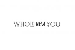
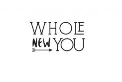
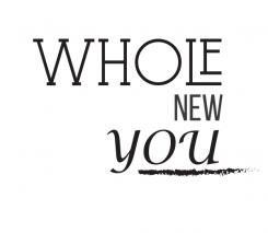
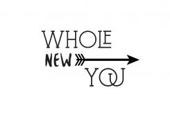
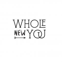
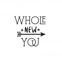
Design a logo for my blog, Whole New You
Contest details:
- Contest holder: wnyblog
- Category: Logo design
- Total budget: € 100.00
- Start date : 27-11-2015 20:05
- Ending date : 04-12-2015 19:55
- Status : Ended
- Required formats: jpg,psd,ai,pdf
- Relevant files: None
-
Available languages:


- Number of designs: 88
-
Response rate:
low high
Needs:
I want to focus on the balance between wholesome foods, and physical- and emotional strength, and how you can achieve this balance through mindful living (e.g. yoga, meditation). I have found this ‘holy trinity’ to be the key to optimal health in today’s world.
I feel very excited to share my experiences, tips, and explorations, since – as a result of illness followed by burnout - I have personally experienced what it’s like to feel desperate for improvement whilst not knowing how to make progress or recover.
Having said that, I consider the blog as a positive result of my experience, a chance to create a platform to exchange ideas with people in similar situations worldwide, or anyone generally seeking to improve their health. The focus will be on the powerful transition that may take effect once you become aware of the right tools to get going.
My goal is to reach a large audience, but since I’m just starting up my budget is still limited. I would be very grateful if anyone can help me out ☺.
Company description:
I'm setting up a new blog called Whole New You.
Target group:
Everyone (both young professionals as generally anyone who seeks to improve their health) interested in and/or seeking for tips or advice to improve their physical, mental and emotional health and well-being. Individuals who want to feel whole - energised, happy and healthy - and whose goal is to become the best version of themselves and enjoy life to the fullest.
The logo may have a more elegant or 'feminine' appearance but it's important that it appeals to a large audience, including men.
Colors, favourites and other requirements
To give you an impression of the look and feel of my blog I’ve created a moodboard and added some examples of fonts I’d like to use for my website. Please use this for your reference when creating the logo.
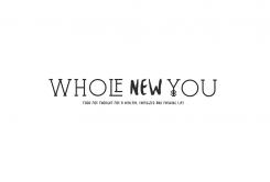
The tone of voice I will use in my writings will be optimistic, and focus on the positive benefits of the health journey: I’d like to see this reflected in the logo. I like a clean and light style, which uses the colors of the moodboard and which appeals to a large audience. The name of the blog (Whole New You) must be part of the logo, the pay-off (“Food for thought for a healthy, energized and thriving life”) can be included optionally (I realise it's quite lengthy, so I'm open to designs in and excluding it). An object may be used if you feel it adds value, but is not a prerequisite.
Keywords: original, transformative, energising, thriving, positivity, optimism, (re)gaining balance, (w)holistic health and living, self-challenge & -development, self-care, enjoying life to the fullest.
More specifically: yoga, meditation, mindfulness, wholesome and nutritious foods, travel, cultural values, nature, photography, sports.
xyz29
-
-
No comments
-
This contest is finished. Its not possible to reply anymore.
-
-
-
No comments
-
This contest is finished. Its not possible to reply anymore.
-
-
-
No comments
-
This contest is finished. Its not possible to reply anymore.
-
-
-
No comments
-
This contest is finished. Its not possible to reply anymore.
-
-
-
No comments
-
This contest is finished. Its not possible to reply anymore.
-
-
-
No comments
-
This contest is finished. Its not possible to reply anymore.
-
-
-
wnyblog says :
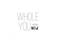
My preference goes to the previous logo, especially the font used for "NEW" and the arrow. The line below the "You" seems a bit irrelevant / redundant in this new design, and the playfulness / optimism of the previous logo is a bit lost in the current logo.
-
This contest is finished. Its not possible to reply anymore.
-
-
-
wnyblog says :
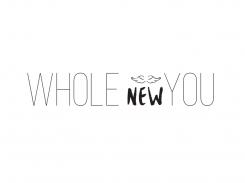
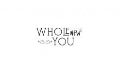
Hi! Thank you for you submission. I like your proposals and style. Nevertheless, I do think the logos are still quite 'busy' looking, too much is going on (for this reason I prefer the 2nd and 3rd logo over the one with the stars). My preference goes to a more 'subtle' logo with a little less interaction. E.g., by using a smaller arrow like in your 2nd example, or a size in between the arrow size in the 2nd and last example. I like the 3 symbolic meaning of the 3 feathers at the end of the arrow though, so please don't change that ☺. I also like the fonts you've used, though it'd be nice to see an example without the O and the U in "You" touching. Looking forward to see another option. Thanks!
-
wnyblog says :
Hi! Thank you for you submission. I like your proposals and style. Nevertheless, I do think the logos are still quite 'busy' looking, too much is going on (for this reason I prefer the 2nd and 3rd logo over the one with the stars). My preference goes to a more 'subtle' logo with a little less interaction. E.g., by using a smaller arrow like in your 2nd example, or a size in between the arrow size of your 2nd and last example. I like the symbolic meaning of the 3 feathers at the end of the arrow though, so please don't change that ☺. I also like the fonts you've used, though it'd be nice to see an example without the O and the U in "You" touching. Looking forward to see another option. Thanks!
-
This contest is finished. Its not possible to reply anymore.
-
-
-
No comments
-
This contest is finished. Its not possible to reply anymore.
-
-
-
No comments
-
This contest is finished. Its not possible to reply anymore.
-

