Design a logo that radiates vitality and energy for an orthomolecular nutritional and lifestyle practice
Contest details:
Silver
- Contest holder: jschantl
- Category: Logo design
- Total budget: € 329.00
- Start date : 23-08-2014 17:15
- Ending date : 06-09-2014 17:03
- Status : Ended
- Required formats: jpg,ai,pdf
- Relevant files: None
-
Available languages:


- Number of designs: 59
-
Response rate:
low high
Needs:
I want to use the logo for my website, business card and and other forms of communication.
Company description:
Ortho Vitale is a practice of orthomolecular therapy. Orthomolecular means the "right particle 'and assumes that a body can only function if it has at its disposal the right materials in the right place properly. Illness occurs when due to a lack of nutrients, sleep or rest the body can not work optimally. My mission is to help to identify the cause of the patients illness. Using nutrition and lifestyle advice along with the use of phytotherapy (medicinal plants) and supplements I fill nutritional deficiencies in the body so that the body is able to heal itself. The healing process is supported by dietary and lifestyle advice.
Overall I beleef that no illness that kan be treated with food should be treated with anything but food.
Target group:
I want to reach people of all ages, children or adults, male or female. A specialty of mine are the intestines because I am convinced that almost all diseases are caused in the intestines. Consider besides bowel symptoms also over/underweight, skin problems, allergies but also fatigue and psychological problems such as ADHD, autism and depression.
Colors, favourites and other requirements
The colors I want for the logo are a fresh green and orange. The font is modern. The logo should radiate vitality and energy next to professionalism. Below the logo, I would like a slogan. I thought to myself, "Naturally healthy! Healthy naturally '. Other slogans let me know! The use of the practice name 'Ortho Vitale' is an option.
apptech
-
-
Description by designer apptech:
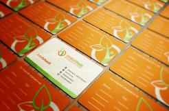
same logo size as on John's card
-
jschantl says :
Great! Thanks!
-
This contest is finished. Its not possible to reply anymore.
-
-
-
Description by designer apptech:
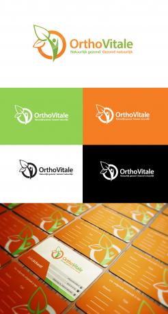
logo is in middle and text color changes to dark grey.
-
jschantl says :
Could you make the logo slightly bigger. I think on the card with John ... on it is a bit bigger
-
jschantl says :
Not the card but the logo on it
-
This contest is finished. Its not possible to reply anymore.
-
-
-
Description by designer apptech:
biz card revised with example of alignment between O and N
your valuable feedback are welcome. -
calomax says
http://www.eatsoulgood.com/
-
apptech says
really..?
r u serious may be i'd change my specs? -
jschantl says :
What do you mean with that?
-
selenia says
@colomax, a copy as usual !
-
This contest is finished. Its not possible to reply anymore.
-
-
-
Description by designer apptech:
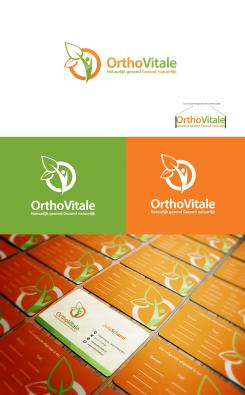
subline fixed with card layout as discussed
-
jschantl says :
it looks to me that the O of OrthoVitale is not outlined with the N of the subtitle. Could that be the case? I guess the spacing between the 2 parts of the subline will become a bit bigger but that should not be a problem I think
-
jschantl says :
it looks to me that the O of OrthoVitale is not outlined with the N of the subtitle. Could that be the case? I guess the spacing between the 2 parts of the subline will become a bit bigger but that should not be a problem I think
-
jschantl says :
it looks to me that the O of OrthoVitale is not outlined with the N of the subtitle. Could that be the case? I guess the spacing between the 2 parts of the subline will become a bit bigger but that should not be a problem I think
-
jschantl says :
Did you use the orange and green you used before as the background looks much as the colors I suggested later but I think your colors look better.
-
apptech says
yeah i use same background color as i used before.i can fix the gap between subline but the O is correct align with N in subline.
-
This contest is finished. Its not possible to reply anymore.
-
-
-
Description by designer apptech:
tagline fixed by removing "!".
can you please send exact details of biz-card via private message, so i can design exact card for you. -
jschantl says :
Is it possible to have the N of the subtitle be exactly outlined with the O of OrthoVitale?
-
jschantl says :
And also the last letter of the subtitle with the e. The space between the green and orange part of the subtitle might bicome a bit bigger but that schould be okay I hope.
-
This contest is finished. Its not possible to reply anymore.
-
-
-
Description by designer apptech:
font variation and color code update.
-
jschantl says :
The orange look the same as the one you used before. The green you used before I think
I like better. Can you give me the color codes so I can compare it better on the computer as I am working on my website with these colores. -
apptech says
Dear CH,
I used these codes for my previous entries:
Orange #f57d24
and for Green #7aaa39
-
jschantl says :
I also like the business card you designed. Is it possible that you make something like that for me as well? The backside is great. I would like to have the adresses aswell as email and webside on the front and on the back I would like to be able to write down the date and the time of an appointment.
I hope to hear from you. -
apptech says
can you please send exact details of biz-card via private message, so i can design exact card for you.
-
This contest is finished. Its not possible to reply anymore.
-
-
-
Description by designer apptech:
subline fixed
-
jschantl says :
At the moment this is my favoriet design. Could you change the subtitle for me one more time making it: Natuurlijk gezond Gezond natuurlijk
So only removing the '!'
-
jschantl says :
At the moment this is my favoriet design. Could you change the subtitle for me one more time making it: Natuurlijk gezond Gezond natuurlijk
So only removing the '!'
-
jschantl says :
Also your green and orange is much better!
-
This contest is finished. Its not possible to reply anymore.
-
-
-
Description by designer apptech:
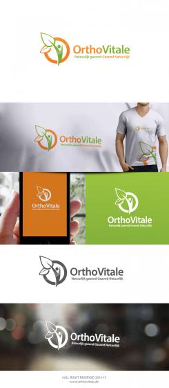
another perspective of initial O&V
-
jschantl says :
Hi aptech! Sorry I made a mistaken in the subscript it schould be ' Natuurlijk gezond! Gezond natuurlijk!' Could jou change this? I was wondering of you could show the logo also without the subscript and also what it looks like to have the O&V initials above OrthoVitale? Thanks!
-
apptech says
okay, i'll fix it.
-
This contest is finished. Its not possible to reply anymore.
-
-
-
Description by designer apptech:
initials "O and V"
-
jschantl says :
I really like your design! Can you adjust the subtitel? It schould be: Natuurlijk gezond! Gezond Natuurlijk! Both starting with a capital letter.
-
jschantl says :
I really like your design! Can you adjust the subtitel? It schould be: Natuurlijk gezond! Gezond Natuurlijk! Both starting with a capital letter.
-
apptech says
okay, i'll update it. thnx for the feedback:)
-
This contest is finished. Its not possible to reply anymore.
-
-
-
No comments
-
This contest is finished. Its not possible to reply anymore.
-


