Design a stylish logo for a photography website
Contest details:
- Contest holder: pepdekker
- Category: Logo design
- Total budget: € 150.00
- Start date : 30-05-2015 13:47
- Ending date : 30-06-2015 13:38
- Status : Ended
- Required formats: jpg,ai,pdf
- Relevant files: None
-
Available languages:


- Number of designs: 144
-
Response rate:
low high
Needs:
Company description:
The logo will be used for a photography website that focusses on travel photography, more specifically landscape/nature and occasionally people. The website does not focus on a specific country. Photography on its own, as well as the travel (the globe) aspect of the website are equally important and hopefully these two elements can somehow be incorporated in the logo.
Target group:
- Anyone with a passion for photography that can appreciate a good photo.
- Companies interested in hiring an upcoming photographer with a intrinsic passion/drive for travel photography
Colors, favourites and other requirements
Color: black, white and maybe one other color (not sure). In case of extra color Im thinking of blue or green.
letter type: stylish, timeless and fresh
Should include (below or within): "Pep Dekker" and "Photography"
mtzgr
-
-
Description by designer mtzgr:
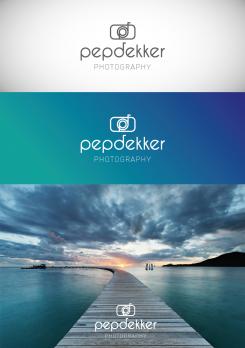
This logo combines a symbol, the name and the baseline. The name is written in a modern font where the “p” and the “d” will be used to make the symbol on top. The symbol refers to the minimal outlines of a camera. It stays fresh and attractive.
I remain at your disposal for any further modification. -
This contest is finished. Its not possible to reply anymore.
-
-
-
Description by designer mtzgr:
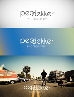
Other proposal with the name in a modern and pleasant font. The “p” and the “d” are connecting to each other to make it more sophisticated.
-
This contest is finished. Its not possible to reply anymore.
-
-
-
Description by designer mtzgr:
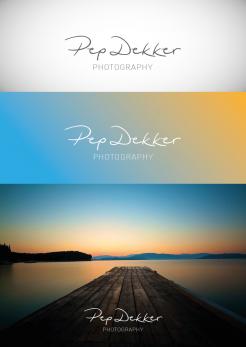
Here is a proposal composed by a handwritten and dynamic font referring to the signature of an artiste. The baseline “photography” in a modern and light font combines very well with the signature and makes clear the field of action. The logo works on top of photographs and gradient backgrounds.
-
This contest is finished. Its not possible to reply anymore.
-


