Design modern / contemporary logo and corporate identity
Contest details:
Silver
- Contest holder: KeesaN
- Category: Logo design
- Total budget: € 329.00
- Start date : 02-04-2014 12:34
- Ending date : 29-04-2014 12:16
- Status : Ended
- Required formats: jpg,ai,pdf
- Relevant files: None
-
Available languages:


- Number of designs: 170
-
Response rate:
low high
Needs:
Our logo is often used in conjunction with the logo of KPN.
As of June 1 Guide Excellence partner, with corresponding KPN logo.
Early this year, our renewed web environment, which we want to pull in logo, letterhead, e-newsletters, business cards, email signature.
Company description:
KPN ICT Guide Platinum Business Partner
Who's Guide ICT and what can we do for you? We combine the best of two worlds; KPN provider of high quality Technology services and Guide-ICT that the correct translation can make to Medium Enterprise Market
We enable our customers to have a "single point of contact" for all KPN services. Professional, accurate and above all enjoyable to work with. Guide-ICT provides the technical / commercial advice, brings the quote for you and ensures that it will work!
Target group:
Medium Enterprise Market, mainly Communications solutions (Fiber connections, Mobile communications, VOIP, IT)
Colors, favourites and other requirements
Have a look at our corporate identity at www.guide.nl
Bleu is required
DesignLeader
-
-
Description by designer DesignLeader:
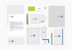
And here is the Brand Identity elements .
Best regards. -
This contest is finished. Its not possible to reply anymore.
-
-
-
DesignLeader says
As promised, here is a bold version of the font .
Brand identity elements are coming in a while, please wait .
Best regards. -
This contest is finished. Its not possible to reply anymore.
-
-
-
No comments
-
This contest is finished. Its not possible to reply anymore.
-
-
-
KeesaN says :
Very nice! what typeface did you use?
-
KeesaN says :
This one is the best of all design's so far.Please show some more Corporate Identity.
Kees -
DesignLeader says
Hi, i'm glad that you've liked my design of your company's logo.
I used a font called : Bi bi Regular , a globe for the general interest for your company.
I'll be glad to introduce more of my work to you . -
DesignLeader says
PS : the font that i've used may be similar to S&L Gothic regular
-
DesignLeader says
Here is the font i used : http://www.dafont.com/fr/acens.font
As i said , it's similar to the SL Gothic font family.
-
KeesaN says :
Try the Bold version of this font, it makes the design more at one pice (font and incon)
-
DesignLeader says
Please clarify the term "incon" .
Best regards. -
This contest is finished. Its not possible to reply anymore.
-
-
-
No comments
-
This contest is finished. Its not possible to reply anymore.
-
-
-
No comments
-
This contest is finished. Its not possible to reply anymore.
-
-
-
No comments
-
This contest is finished. Its not possible to reply anymore.
-
-
-
No comments
-
This contest is finished. Its not possible to reply anymore.
-
-
-
No comments
-
This contest is finished. Its not possible to reply anymore.
-
-
-
No comments
-
This contest is finished. Its not possible to reply anymore.
-

