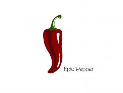
Epic Pepper Icon Design
Contest details:
Silver
- Contest holder: Tjarco
- Category: Logo design
- Total budget: € 299.00
- Start date : 24-09-2013 18:47
- Ending date : 23-10-2013 18:42
- Status : Ended
- Required formats: jpg,psd,ai,pdf
- Relevant files: None
-
Available languages:


- Number of designs: 119
-
Response rate:
low high
Needs:
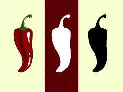
For this contest we would like to see a 4 colour design (One design using 4 colors only) and a black and white version.
PLEASE REFER to the attached PDF for a detailed visual description plus reference to styles and our other preferences.
Company description:
Starting fashion brand
Target group:
Think fresh, sexy, smart and tough
Colors, favourites and other requirements
Please refer to the PDF - Vector is preferred but scanned artwork will do as well, we can vectorize it ourselves.
Retinnio
-
-
No comments
-
This contest is finished. Its not possible to reply anymore.
-
-
-
Tjarco says :
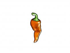
Hmm this is too grungy and shiny for our liking
-
This contest is finished. Its not possible to reply anymore.
-
-
-
Tjarco says :
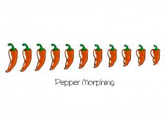
Good Idea, the shape we like best is the second and third one from the right
-
This contest is finished. Its not possible to reply anymore.
-
-
-
Tjarco says :
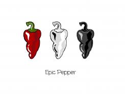
White version is cool
-
This contest is finished. Its not possible to reply anymore.
-
-
-
Tjarco says :
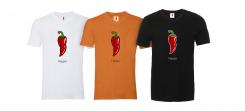
yup.. t-shirts
-
This contest is finished. Its not possible to reply anymore.
-
-
-
Tjarco says :
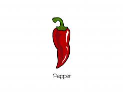
haha I wonder why you dropped the 'epic'
-
This contest is finished. Its not possible to reply anymore.
-
-
-
Tjarco says :
more t-shirts
-
This contest is finished. Its not possible to reply anymore.
-
-
-
Description by designer Retinnio:
Hello,
thank you for your great compliment, I am very honored, because for a Restaurante it would not be bad :)
I have once again made me to work and it spiced up a bit.
Maybe I'm jumping from his plate, or landed in the soup ... :)
Many greetings
Retinnio -
Tjarco says :
Yes, I like what you did to the style! The shape of the pepper is not the strongest one i've seen in the competition. Look at some of the high-scoring designs and incorporated with you style it could be a very good submission.
-
This contest is finished. Its not possible to reply anymore.
-
-
-
Tjarco says :
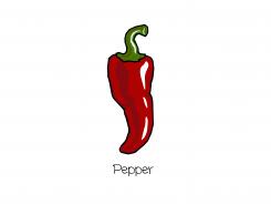
Yep it is a epic pepper, not the one we are looking for though..
-
This contest is finished. Its not possible to reply anymore.
-
-
-
Tjarco says :
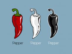
If we were opening a wine&chorizo; bar, this would be the logo.. too bad for you we are working on a fashion brand and this feels a bit too slick and too less playfull..
-
This contest is finished. Its not possible to reply anymore.
-

