Epic Pepper Icon Design
Contest details:
Silver
- Contest holder: Tjarco
- Category: Logo design
- Total budget: € 299.00
- Start date : 24-09-2013 18:47
- Ending date : 23-10-2013 18:42
- Status : Ended
- Required formats: jpg,psd,ai,pdf
- Relevant files: None
-
Available languages:


- Number of designs: 119
-
Response rate:
low high
Needs:
For this contest we would like to see a 4 colour design (One design using 4 colors only) and a black and white version.
PLEASE REFER to the attached PDF for a detailed visual description plus reference to styles and our other preferences.
Company description:
Starting fashion brand
Target group:
Think fresh, sexy, smart and tough
Colors, favourites and other requirements
Please refer to the PDF - Vector is preferred but scanned artwork will do as well, we can vectorize it ourselves.
studioZ
-
-
Description by designer studioZ:
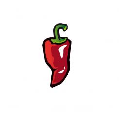
Thanks for the quick feedback, here is the adjusted one, hopefully what you meant.
-
Tjarco says :
Hmm stern and corner are good, the shape however became less strong than your other one, I'm sorry if we send you in the wrong direction. This one is missing the 'dent' on both sides which makes the other one more appealing.
-
This contest is finished. Its not possible to reply anymore.
-
-
-
Description by designer studioZ:
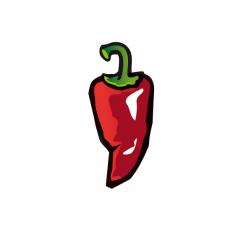
Hi, not sure if I should write in english, but I will. Here is my idea for the pepper. Looking forward to your reaction,
Connie -
Tjarco says :
Yes! 4 colors, black outline, kinda wrinkly/aged, best submission so far. Few points of improvement: 1. from a distance it doesnt't look like a pepper, maybe you can move the bottom part a bit to the left to make the right side a bit more diagonally tapering down to the bottom (hope this is clear) 2. can you mirror the stern (just feels better) and the right top corner is a bit pointy.. Great work!
P.S. I'm keeping everything in English for the international competitors -
This contest is finished. Its not possible to reply anymore.
-


