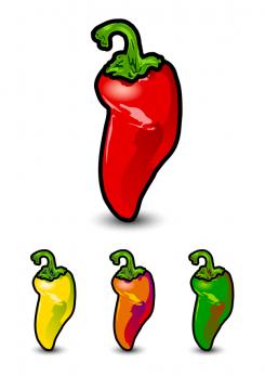
Epic Pepper Icon Design
Contest details:
Silver
- Contest holder: Tjarco
- Category: Logo design
- Total budget: € 299.00
- Start date : 24-09-2013 18:47
- Ending date : 23-10-2013 18:42
- Status : Ended
- Required formats: jpg,psd,ai,pdf
- Relevant files: None
-
Available languages:


- Number of designs: 119
-
Response rate:
low high
Needs:
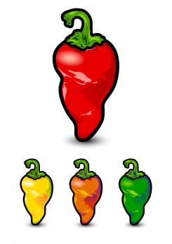
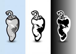
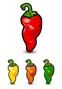
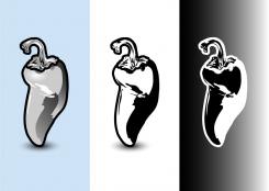
For this contest we would like to see a 4 colour design (One design using 4 colors only) and a black and white version.
PLEASE REFER to the attached PDF for a detailed visual description plus reference to styles and our other preferences.
Company description:
Starting fashion brand
Target group:
Think fresh, sexy, smart and tough
Colors, favourites and other requirements
Please refer to the PDF - Vector is preferred but scanned artwork will do as well, we can vectorize it ourselves.
DutchDesigners
-
-
Description by designer DutchDesigners:
Last version!
-
This contest is finished. Its not possible to reply anymore.
-
-
-
Tjarco says :
yup stil cool
-
This contest is finished. Its not possible to reply anymore.
-
-
-
Description by designer DutchDesigners:
Mixed feelings about this shape...
-
Tjarco says :
Yeah! I feel what you are saying. The top part is great and the bottom part is the best one I've seen so far. The two don't connect well is what I think you are saying... If you move around the two parts to make the whole thing shorter in length and fatter in width it will work out perfect... Ahh the bottom is so right :D
-
DutchDesigners says
Thanks for liking my top and bottom :P Will work on the in between part :D
-
This contest is finished. Its not possible to reply anymore.
-
-
-
Tjarco says :
I believe your black & white version will be awesome!
-
This contest is finished. Its not possible to reply anymore.
-
-
-
Tjarco says :
The stern is awesome! Feel stupid for saying it's almost too detailed. Looking at the top part of the pepper I really feel the flow this pepper is showing, it don't last to the bottom though. Wonde rhow it looks like if you create another dent on the left side and almost mirror the foot to the right side, and than rotate the entire pepper to make it stand straight again.. I like the use of red in the green one, the purple in the orange makes it look like it's been photographed underneath a blacklight. Very good submission!
-
DutchDesigners says
Hi Tjarco, thanks for your enthousiastic respons. Yes, I already tried the second dent you mention & described in the pdf, but immediately discarded it because 1. the shape lost its boldness and 2. it looked like the pepper caved in under its own weight. I already put in a lot of time in this but I will see what I can do. Cheers, Anneke
-
Tjarco says :
"caved in under it's own weight" I feel what you're saying. Dried peppers can take a lot of weird shapes though. Really curious to what you will show next.
-
This contest is finished. Its not possible to reply anymore.
-

