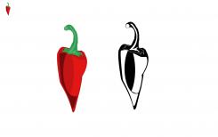
Epic Pepper Icon Design
Contest details:
Silver
- Contest holder: Tjarco
- Category: Logo design
- Total budget: € 299.00
- Start date : 24-09-2013 18:47
- Ending date : 23-10-2013 18:42
- Status : Ended
- Required formats: jpg,psd,ai,pdf
- Relevant files: None
-
Available languages:


- Number of designs: 119
-
Response rate:
low high
Needs:
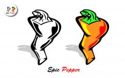
For this contest we would like to see a 4 colour design (One design using 4 colors only) and a black and white version.
PLEASE REFER to the attached PDF for a detailed visual description plus reference to styles and our other preferences.
Company description:
Starting fashion brand
Target group:
Think fresh, sexy, smart and tough
Colors, favourites and other requirements
Please refer to the PDF - Vector is preferred but scanned artwork will do as well, we can vectorize it ourselves.
Petje
-
-
No comments
-
This contest is finished. Its not possible to reply anymore.
-
-
-
Tjarco says :
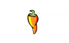
Yeah the two dents on the left side are cool. I think is will look better when the corners are more bevelled (round) than edgy corners..
-
This contest is finished. Its not possible to reply anymore.
-
-
-
Tjarco says :
Every submission getting better than the previous
-
This contest is finished. Its not possible to reply anymore.
-
-
-
Tjarco says :
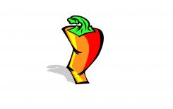
These colors are a bit less cool than your other orange proposal, stern is still a bit pale though, not bright shining green. The shape is not a winner, yet.
-
This contest is finished. Its not possible to reply anymore.
-
-
-
Tjarco says :
These colors are cool, stern is a bit pale though, not shining bright green. The shape is not a winner yet.
-
This contest is finished. Its not possible to reply anymore.
-
-
-
Tjarco says :
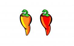
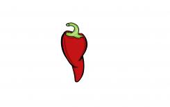
I like the wrinkles created on both sides with the black outlines. Every design of yours is coming closer to the strong and confident pepper we are looking for.
-
Petje says
Hello Tjarco ,
Thanks! what can i do to make this one better i like the feedback on it!
with regards Petje -
This contest is finished. Its not possible to reply anymore.
-
-
-
Tjarco says :
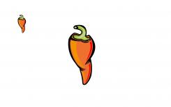
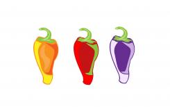
This coloring style is to abstract, it doesnt accentuate the shape or structure fo the pepper.
Shape is getting better but feels like you copied our example (wire drawing) which we thought wasn't strong enough at all.. -
Petje says
Yes maybe were i looking to much at the example Tjarco
gonna try make it better !
thanks for your feedback again!
regards Petje -
This contest is finished. Its not possible to reply anymore.
-
-
-
Tjarco says :
This coloring style is to abstract, it doesnt accentuate the shape or structure fo the pepper.
-
This contest is finished. Its not possible to reply anymore.
-
-
-
Tjarco says :
This is heading in the good direction
-
Petje says
Hello Tjarco
Thanks!
And your feedback is welcome to make it better
with regards Petje -
Tjarco says :
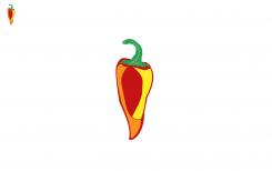
Stern could be a bit less long and a bit wider. The bottom shape of the pepper is too simple. Colorscheme could use more oranges and yellows.. Black & white version is just ehh.. weird? haha
-
Petje says
Hello Tjarco
Gonna work on it thanks for your feedback Tjarco
with regards Petje -
This contest is finished. Its not possible to reply anymore.
-

