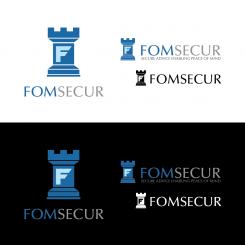
FOMSECUR: Secure advice enabling peace of mind
Contest details:
Silver
- Contest holder: markfolmer
- Category: Logo design
- Total budget: € 299.00
- Start date : 05-03-2013 21:27
- Ending date : 19-03-2013 21:23
- Status : Ended
- Required formats: jpg,ai,pdf
- Relevant files: None
-
Available languages:

- Number of designs: 108
-
Response rate:
low high
Needs:
Company description:
more information on the company can be found on the linked in profile at :
Linkedin:http://ca.linkedin.com/in/markfolmer
Target group:
medium and large businesses. all work executed by our consultants is B2B.
Colors, favourites and other requirements
note I made a typo in the contest name ... the business is called FOLMSECUR (i missed the L).
i would like the logo to not be too busy. not too many colors (2 or 3 max). shading is ok with the letters. I typically write the letters s c and u in a different color (the remaining letters spell my name).
I prefer to not have the - secure advice tagline in the logo - because of the billingual nature of the local market.
I am not 100% stuck on the rook imagery.
SteSa
-
-
Description by designer SteSa:
10. - perfected, in the blue
-
This contest is finished. Its not possible to reply anymore.
-
-
-
Description by designer SteSa:
9
-
This contest is finished. Its not possible to reply anymore.
-
-
-
Description by designer SteSa:
8.
-
This contest is finished. Its not possible to reply anymore.
-
-
-
Description by designer SteSa:
7.- new idea
-
This contest is finished. Its not possible to reply anymore.
-
-
-
Description by designer SteSa:
6.- new idea
-
This contest is finished. Its not possible to reply anymore.
-
-
-
Description by designer SteSa:
5.- new idea
-
This contest is finished. Its not possible to reply anymore.
-
-
-
Description by designer SteSa:
3.b - I corrected business name and integrated image in the name.
Here you have two variant : slightly marked your name with a different shade of red , and emphasized,in which is company engaged in with a different color . -
mangus says
TAKING OUT EAGLE FROM IT - DOES NOT MEAN THIS SHIELD IS NOT GERMAN ARMY AMBLEM.
STOP GOOGLING & COPYCATING
THATS A FELONY -
This contest is finished. Its not possible to reply anymore.
-
-
-
Description by designer SteSa:
2.b - I corrected business name and integrated image in the name. I also pointed out your name with blue color.
-
This contest is finished. Its not possible to reply anymore.
-
-
-
Description by designer SteSa:
4.proposal for logo
-
markfolmer says :
please note that i made a typo - the business name is FOLMSECUR.
i like the cleanliness of the logo and how the image is integrated in the business name but am not sure of the key image. -
mangus says
THE GREEN KEY company logo!!!
NICE COPYCAT
START DOING YOU OWN WORK!!!
There are other sites exept GOOGLE!!! -
This contest is finished. Its not possible to reply anymore.
-
-
-
Description by designer SteSa:
3.proposal for logo
-
markfolmer says :
like the F on a shield - tower - well done. note i made a typo on the business name - should be FOLMSECUR. wondering how it would look with the F on the shield being the first letter of folmsecur?
-
This contest is finished. Its not possible to reply anymore.
-
-
-
Description by designer SteSa:
2.proposal for logo
-
markfolmer says :
interesting as the F is part of the rook body. not sure I like the contrasting color of the orange F in the grey tower. may be neat to see the F as the same color. would like to see the S C U being the letters in a different color. please note that I did a typo in the contacte name - should be FOLMSECUR.
-
mangus says
STOLLEN!!!
http://tenwordsperday.blogspot.com/2011_06_01_archive.html
STOP GOOGLING OTHER PEOPLES WORK & PUTTING YOUR NAME ON IT! THATS A FELONY! -
This contest is finished. Its not possible to reply anymore.
-

