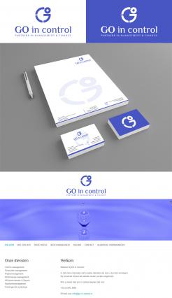
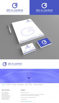
GO in control - Logo, business card and webbanner
Contest details:
- Contest holder: GO in control
- Category: Logo design
- Total budget: € 225.00
- Start date : 23-01-2016 02:04
- Ending date : 09-02-2016 02:01
- Status : Ended
- Required formats: jpg,psd,ai,pdf
- Relevant files: None
-
Available languages:


- Number of designs: 59
-
Response rate:
low high
Needs:
Zie bestaande website www.go-in-control.nl voor huidige stijl.
Op zich niet eens verkeerd, maar de banner mist de echte connectie naar het bedrijf. Het is een bestaand beeld en maakt het geheel noodgedwongen wel erg blauw.
(Lettertype blijft bij voorkeur ongewijzigd omdat ik het bestaande WP thema wil blijven gebruiken).
I'd like to get a new logo, business card and webbanner.
The new brand gives a professional business look. It reflects knowledge and skills. Preferably simple and elegant, (limited) use of color.
The logo refers to motion (GO) and being 'in control'.
GO in control
Partner in management & finance
See current website www.go-in-control.nl for current style.
Company description:
GO in control a new company. Services provided are interim management and advisory on finance, project management, performance and quality.
'GO' reflects de owner's initials, 'in control' reflects being in control of business processes and results. Together the words reflect the motion to get in control. This is an important aspect, it reflects the dynamic and stands for change and improvement.
Our company mission: With ambition, knowledge and skills, improving performance of organisations and its workers.
Take a look at our current website www.go-in-control.nl to get an impression of the company (dutch only).
Target group:
Customers and business relations, recruiters
Colors, favourites and other requirements
?
(combination of)
Blue (business, professial)
Green (growth, durability, sustainability)
VirtualLies
-
-
Description by designer VirtualLies:
Thank you for the typo information ;) Attached the version with the splittings you mentioned, and the typo Philosopher. For any further improvements I'll be at your disposal, kind regards, Dagmar Lange
-
GO in control says :
Tnx again. I just saw it mentions 'partners'; should be 'partner'. Minor issue, can be resolved later. For now it looks very nice.
-
This contest is finished. Its not possible to reply anymore.
-
-
-
Description by designer VirtualLies:
Good morning GO in control,
thank you for your positive rating. Attached a revision with a better readable head- and subline and a first layout for an according housestyle and a web banner. Looking forward to your reply, kind regards, Dagmar Lange -
GO in control says :
Tnx again. It's a nice and clean design this way, i like it. I'm doubting if the G could get some extra dynamics splitting it into 2 maybe 3? Not sure if that will work though.
-
GO in control says :
Is it possible to use the same font as used on my website? Tnx.
-
GO in control says :
The fontfamily is Philosopher, tnx.
-
This contest is finished. Its not possible to reply anymore.
-
-
-
GO in control says :
Nice color. The bottom line could be more present (just blue/white only? Interesting design
-
This contest is finished. Its not possible to reply anymore.
-
-
-
GO in control says :
I like the other version with the full O better
-
This contest is finished. Its not possible to reply anymore.
-
-
-
Description by designer VirtualLies:
Thank you for your feedback & rating, attached two versions in sapphire blue & green color combination. Kind regards, Dagmar Lange
-
GO in control says :
Tnx. Still looks a bit too busy to me
-
This contest is finished. Its not possible to reply anymore.
-
-
-
No comments
-
This contest is finished. Its not possible to reply anymore.
-
-
-
GO in control says :
Naam en ondertitel spreken me aan qua opzet. Blauwe kleur zou wat feller/donkerder mogen (bv. richting sapphire).
Het logo is leuk gevonden, wellicht wat druk. Ronde pijl is beter dan de rechte pijl. -
This contest is finished. Its not possible to reply anymore.
-

