IGGY
Contest details:
- Contest holder: IGGY
- Category: Logo design
- Total budget: € 350.00
- Start date : 29-02-2012 11:44
- Ending date : 30-03-2012 11:42
- Status : Ended
- Required formats: jpg,psd
- Relevant files: None
-
Available languages:


- Number of designs: 145
-
Response rate:
low high
Needs:
Type of logo & inspiration: as the mascot of the rolling stones ( no copy of roling stone mascot) or only use the brand name IGGY or IGGY + mascot.
before we have the idea that the "i" IGGY is a thumbs up http://www.hellopro.fr/images/produit-2/8/4/7/pouce-1242748.png
why not leave the dot shape of the hand in the logo.
you can also consider a mascot that could be in this style http://www.fontainesbouillantes.com/dotclear/public/blowup-images/i_want_you.jpg
Company description:
We are looking for a logo of futur mark "tee shirt" at first, then various clothes afterwards.
brand name: IGGY
Target group:
Inspiration: IGGY POP - rolling stones (no guitar or other musical instruments on the logo, no cross)
Target: man 18 to 35 years
Style shirt: V-neck t-shirt style American apparel
Colors, favourites and other requirements
Color: red, white, black or other, the important thing for us is to have three colors.
kc designing
-
-
Description by designer kc designing:
Met de thumbs up!
-
This contest is finished. Its not possible to reply anymore.
-
-
-
Description by designer kc designing:
Zie ook commentaar bij mijn vorig ontwerp.
-
This contest is finished. Its not possible to reply anymore.
-
-
-
Description by designer kc designing:
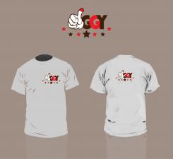
Here by i present to you another version with an example on a t-shirt. I placed the letters on a different place. Added some stars to add more rock n roll effect.
I hope you like the change :-) -
kc designing says
Hi Iggy,
Can you tell me what you're thoughts are over the logo I created? What can be different? What are you missing?
Sincerely,
Ko-Lin Chang -
This contest is finished. Its not possible to reply anymore.
-
-
-
Description by designer kc designing:
Another version, other colors and no thumbs on the "Y".
-
IGGY says :
thank you for your proposals
-
kc designing says
What do u think about the colors and the logo?
Any comments on it? -
IGGY says :
I like the colors. as the contest was launched today, we need to wait for the other proposals.
Thank you very much for all your suggestions -
This contest is finished. Its not possible to reply anymore.
-
-
-
Description by designer kc designing:
Enjoy IT!
-
This contest is finished. Its not possible to reply anymore.
-
-
-
Description by designer kc designing:
Beste Iggy,
Hierbij een eerste ontwerp vanuit schets. Ik vraag u daarom om feedback te geven op de vorm en het idee. Niet zozeer over de kwaliteit of kleurstelling, dit kan later nog altijd veranderd worden.
Ik hoor graag iets van u
MVG,
Graphicraven -
IGGY says :
thank you for your submission and fast proposal.
my first impression is that I can not quite read the brand name.
best regards,
Olivier -
IGGY says :
thank you for your submission and fast proposal.
my first impression is that I can not quite read the brand name.
best regards,
Olivier -
IGGY says :
maybe the name should be written in capital letters: IGGY
-
kc designing says
Thanks for the fast reaction! True, I can imagine you are not seeing the IGGY in it. Are you looking for a brandmark in the text or you leave this to the designer? This is no typeface, i created it.
I will brainstorm some more and how to include the logo in the text or maybe not.
Nice project to work on! -
IGGY says :
we put more information on the project description.
before we have the idea that the "i" IGGY is a thumbs up http://www.hellopro.fr/images/produit-2/8/4/7/pouce-1242748.png
why not leave the dot shape of the hand in the logo.
this brand will be rock n'rool :) -
This contest is finished. Its not possible to reply anymore.
-


