Interior designer & blogger seeks logo
Contest details:
- Contest holder: Mint&Mocha
- Category: Logo design
- Total budget: € 250.00
- Start date : 19-11-2013 17:02
- Ending date : 19-12-2013 16:54
- Status : Ended
- Required formats: jpg,ai,pdf
- Relevant files: None
-
Available languages:


- Number of designs: 113
-
Response rate:
low high
Needs:
The logo should be clean, simpel yet reflect the creative line of business I am in. The logo should be versatile enough to use for future other business spin-offs such as on-/offline shop and products that I might develop
Company description:
an interiors designer and blogger with a clean and simple basic style yet with a colorfull / playfull touch
Target group:
everyone in the age 0f 25-75 with an interest of making their house a home
Colors, favourites and other requirements
not girly or frilly, not masculine and no real objects in the logo. The logo could either be just the name (Mint&Mocha) of have a simpel / fun symbol. I should be able to use it for different business spinoffs such as " blog" " interiors" etc
lyra
-
-
Description by designer lyra:
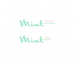
Here is a proposal for the changed name.
Your feedback is welcome. -
Mint&Mocha says :
thanks for the new submission. the lettertype instantly reminds me of a very famous brand (but cannot think of it right now...). so unfortunately a no.
-
This contest is finished. Its not possible to reply anymore.
-
-
-
lyra says
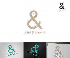
Here is my concept for your logo. It is clean, simple and suitable for any medium (for web&print;), in color or black& white. Logo elements (color, font, etc.) can be changed if needed. Looking forward to your thoughts on this design. Thanks.
-
Mint&Mocha says :
hi lyra, thank you so much for your submission. it looks interesting and noice how you integrated a mintleave and coffeecup. 'danger' could be that people associate it a bit with a coffeebar, but that is also due to the name. i have therefore decided to change the name into mint interiors and mint blog. maybe we could leave thr coffee cup and mocha color out?
-
lyra says
Hi Katja, I'm glad you like the concept. Pity you've changed the name. I think it was more personal than the current version(s). Mint&Mocha; was a kind of your "cup of tea" - as you wrote at your lovely website.
For me is not a problem to leave out the cup (handle), or even to make an "I" and "B" (for interiors and blog) instead of a cup. But then, I think, the "&" sign as the logo image makes no sense since there is no more "&" in the title(s). If you still want me to submit a logo version with the same &-sign, please let me know. -
Mint&Mocha says :
the name change is a bt due to the fact that a already had a contest last month and no good logo came from it... the name also is a bit to 'coffee-bar' and needed to be cleaner.
-
Mint&Mocha says :
hi lyra, stil really like your first logo. i am considering keeping the mint & Mocha name for my blog and only naming my interior design business mint interiors. but then stil I would need 'matching' logos. would you see an opportunity to do something with you first logo so it's adaptable for both? thanks a lot! katja
-
This contest is finished. Its not possible to reply anymore.
-


