Jong en hip logo voor een factory of the future product
Contest details:
Bronze
- Contest holder: stcorp
- Category: Logo design
- Total budget: € 229.00
- Start date : 21-11-2014 08:56
- Ending date : 01-12-2014 09:53
- Status : Ended
- Required formats: jpg,psd,ai,pdf
- Relevant files: None
-
Available languages:


- Number of designs: 53
-
Response rate:
low high
Needs:
summarised as smart analytics for manufacturing and industry.
Keywords are Big data and sensors.
We are looking for a logo so can start building a brand around the product.
Important requirements -
*The logo should revolve around the word SHAPE. This can be upper or
lower case.
*Must involve the theme manufacturing/factory. Perhaps in the form of
stereotypical manufacturing equipment/machines (for example a cog).
Suggested but not necessarily requirements -
*Incorperation of existing S[&]T colour theme (red,html810000,cmyk0,100,100,49).
*Involvement of a data analytics theme. Scientific graphs or monitoring
tools
*Involvement of a "big data"/ sensor network theme.
The logo should not be convoluted and busy.
It should look great at high resolution, yet still destinguishable at
lower resolutions.
Company description:
S&T is a company with its roots in the earospace industrie. It offers big data analytics in the form of customer specific software .
Our team of professionals consists almost exclusively of PhD and MSc engineers that combine a high level of systems engineering with their science skills. This is what makes us unique in the market. Our drive is to provide our customers with innovative, reliable and user-friendly solutions for complex problems
Target group:
Shape targets the manufacturies that want to make the next step in production efficiency to lower costs of production and waste material.
Colors, favourites and other requirements
Please keep close to our house style (stcorp.nl)
but as this is a seperate product not the exact same style.
incorperating the red colour in some way is fine.
Logosaurus
-
-
Description by designer Logosaurus:
Hello,
I am proud and happy to present my first design proposal for the logo for 'Shape'.
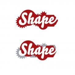
I chose a font that has visual contrast with the sharp outlines of the cog wheels (since this is a product logo it should have a distinct own look), but I also made a proposal with ‘Thesis Sans’, to keep it closer to the corporate identity of S&T.
Also I show the possibility of using two colours in stead of just one.
I hope you like the strong silhouette of this design and I am looking forward to your comments.
Kind regards, logosaurus -
This contest is finished. Its not possible to reply anymore.
-
-
-
No comments
-
This contest is finished. Its not possible to reply anymore.
-


