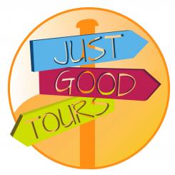
Just good tours Logo
Contest details:
Gold
- Contest holder: Justgoodtours
- Category: Logo design
- Total budget: € 399.00
- Start date : 12-12-2012 17:45
- Ending date : 20-12-2012 17:43
- Status : Ended
- Required formats: jpg,ai,pdf
- Relevant files: None
-
Available languages:

- Number of designs: 68
-
Response rate:
low high
Needs:
For the logo we were thinking on creating a very original guy (like in the attached file) it has to have a feature that will become part of the brand. This could be a swim swuit, sun glases, something creative. We are looking for something very simple that people can relate to very easy. We are open to suggestion and leave the creativity on your side!
Company description:
If you want to find out more about our company please check:
www.justgoodtours.com
We are currently developing the webpage but you will find information that could help you.
The logo needs to transmit our values. We believe in good reputation and friendship. Even if the visitor is not a recurring customer and never comes back, it shall always be our customer. We strive in providing a fine service, in order for our client to go back home with a big smile and to speak good about us and Mexico. Our commitment is to have an impeccable reputation, making all clients our friends. We want clients to trust us. Our webpage is clear, there are no small letters, they should trust our honesty.
Based on this ideas we are trying to have a fresh imagine, our webpage is like this one, it has bright colors and beautiful pictures. And we are combining this with original videos.
I dont know much about the formats but we have to be able to upload the logo in our webpage.
If you have further questions please dont hesitate to contact me directly.
Target group:
People 20 to 40 years. But it should be appealing for the general public.
Colors, favourites and other requirements
Check our webpage.
VERSUS Design
-
-
Description by designer VERSUS Design:
Please find here my proposition for your brand's logo. I have choosen bright colors to match your dynamic project. Also, I have prefered not to use any character, for 2 reason : First, it can pollute a logo and make it unreadable from far away. Besides, if I may say, I think that the cusomer you're aiming( 20-40 years old) is not as fond fo anthropomorphism as 60+ years old or juniors. This is why I have choosen a "web 2.0" style.
Please feel free to comment and to ask for changes.
I hope my message will be clear for you, (I'm French). If not, ask me for more information.
++ -
This contest is finished. Its not possible to reply anymore.
-

