Lady & the Fox needs a logo.
Contest details:
Silver
- Contest holder: Lady and the fox
- Category: Logo design
- Total budget: € 329.00
- Start date : 31-12-2014 08:59
- Ending date : 03-02-2015 18:00
- Status : Ended
- Required formats: jpg,ai,pdf
- Relevant files: None
-
Available languages:


- Number of designs: 134
-
Response rate:
low high
Needs:
One of the things a new bussiness needs is of course: a logo.
We would use this logo on our car, to brand our material, bussiness cards and website ( www.ladyandthefox.be) and a facebookpage.
Under here you can read more information about who we are and what we do.
Company description:
Lady and the fox are partners in life and work.
The fox is the set manager on set.
That means he helps where needed and has to be fast . He is the one that prepares the set so the first assistant and director can immediately do their jobs without having to worry about cars, tents, people in the image that don't belong, traffic control.
With the help of his assistants he makes sure the set is ready to film.
The Lady is the one that looks for all the locations of the film/serie/commercial.
She is the one that has to act like a lady . On the moment she rings doorbells , she is the face of the film and has to earn the trust of owners to use their homes/bars/.... as a film location.
When the location is chosen, she helps were needed on set and arranges all logistics features like lunch, parking, breakfast, tables, police, agreements....
Lady and the fox also rents logistics like tables, chairs, tents, coffee machines (the most important thing to start a filmset :) ), traffic signs, electricity., walkie talkies ....
When we work we always wear a walkie talkie and earpiece.
Target group:
With our company we would like to approach producers to work with, location managers and other event companies that want to rent our material .
Colors, favourites and other requirements
We are open to a lot of suggestions!
We like the colors white and orange (like a traffic cone), but these are not necessary.
Y-graphic design
-
-
Description by designer Y-graphic design:
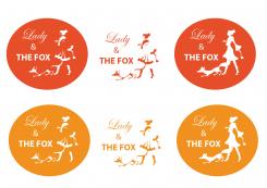
Thanks for the compliment. Here are the logo's in two different shades of orange. I agree with you that the two in the middle, without the ovals, come out the strongest. Kind regards
-
This contest is finished. Its not possible to reply anymore.
-
-
-
Description by designer Y-graphic design:
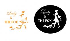
The left logo is also a possible, parts of the lady and the fox cut out of the oval. Kind regards
-
Y-graphic design says
I'm looking forward to your feedback before this challenge's closed. Gr
-
Lady and the fox says :
I like this logo a lot... do't know for sure if i Like the oval.. can you try fill it in orange?
-
This contest is finished. Its not possible to reply anymore.
-
-
-
Description by designer Y-graphic design:
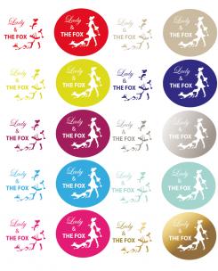
Difficult, I'd like to hear which color you prefer. Kind regards
-
This contest is finished. Its not possible to reply anymore.
-
-
-
Description by designer Y-graphic design:
Hi, I designed a new version of one of your favorites, but I drew it myself ;-) Like to hear feedback
-
Lady and the fox says :
Can you try giving it another color? I like it, thanks
-
This contest is finished. Its not possible to reply anymore.
-
-
-
No comments
-
This contest is finished. Its not possible to reply anymore.
-
-
-
Description by designer Y-graphic design:
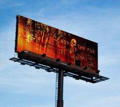
My logo suggestion. Simple but powerful. Like to hear your feedback. Gr
-
This contest is finished. Its not possible to reply anymore.
-

