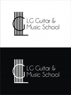
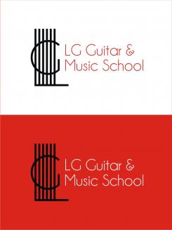
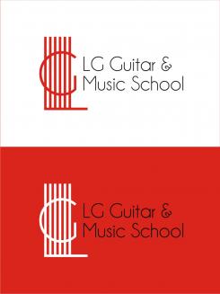
LG Guitar & Music School
Contest details:
Gold
- Contest holder: lgguitarschool
- Category: Logo design
- Total budget: € 479.00
- Start date : 28-03-2015 13:07
- Ending date : 11-04-2015 12:47
- Status : Ended
- Required formats: jpg,psd,ai,pdf,eps,svg
- Relevant files: None
-
Available languages:


- Number of designs: 147
-
Response rate:
low high
Needs:
We would like the logo to express the following:
friendly, fun, proffesional, international, flexible, modern, accesable, ethical, for the community.
Company description:
LG Guitar & Music School is a growing guitar and music school located in Amstelveen. The business exists for about two years. The name will change later to LG Guitar & Music School so we would like the logo to match that name. LG Guitar & School now teaches guiar and piano but in the future possibly more instruments like drums, singing ec
Target group:
Community of Amstelveen and surroundings, all ages: children 6+ years and adults
Colors, favourites and other requirements
We said earlier in the contest that we would like to see the colour red somewhere in the logo. But feel free to use other colours if you think they fit better.
We would like a simple logo that is future proof.
We are not necisarily looking for a logo with a guitar. We'd like to avoid the general guitar logo concepts, even though that probably makes it very hard.... Do feel free to send in any logo's you think are good. We probably would be happy with abstract logos as well.
We would also like to invite you to make an beautiful and usable graphic representation of just the words LG Guitar and Music School. It will be less of a "logo" then, but still very usable for advertisement purposes.
stevan banjac
-
-
No comments
-
This contest is finished. Its not possible to reply anymore.
-
-
-
stevan banjac says
a greeting.
thanks for the suggestions. you can select the background color, the color of the logo, the color of the text. -
This contest is finished. Its not possible to reply anymore.
-
-
-
No comments
-
This contest is finished. Its not possible to reply anymore.
-
-
-
No comments
-
This contest is finished. Its not possible to reply anymore.
-
-
-
stevan banjac says
a greeting.
corrects the text. I think it's a good relationship of text and logos -
This contest is finished. Its not possible to reply anymore.
-
-
-
stevan banjac says
a greeting.
I suggest you a white background. logo positive.
and you can suggest the background color you want
I suggest you letters champagne & limousine. logo was designed by the guy letters.
I set a larger font.
thanks for the suggestions. -
lgguitarschool says :
Hello again, we liked the logo better when all letters were equally sized. But visibility is a lot better with the bigger letters. We would like also like to keep the "&". Is it possible to make the logo more compact & bigger lettered like LG GUuitar here?
-
This contest is finished. Its not possible to reply anymore.
-
-
-
lgguitarschool says :
Thank you
-
This contest is finished. Its not possible to reply anymore.
-
-
-
lgguitarschool says :
Hello Steven, thank you. Original and representative for a guitar school. Also took a look at other logos you made. Very nice, you really catch the essence.
-
lgguitarschool says :
Hi Steven, we still like your logo for many reasons. We are wondering if there is a possibility to make this logo a bit more modern (for example by changing the lettertype). We are also curious what this logo does on a different background color (white or something else).
-
lgguitarschool says :
Hi Steven, This is still our preferred logo (the firs one). Could we receive this one in white (black background), black(white background), red (black background). Then we are wondering if a hint of color in the logo itself would be nice? For us hard to imagine if that works or absolutely not....
-
lgguitarschool says :
Larger font was good in later logo. Lettertype of this first one and equal size of the letters had our preference. We would like the logo to be as compact as possible.
-
lgguitarschool says :
Sorry keep writing Steven and not Stevan, PS think we dit not really understand who designed this logo? The guy letters?
-
This contest is finished. Its not possible to reply anymore.
-

