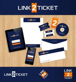
Logo + business card for E-ticketing company
Contest details:
Bronze
- Contest holder: avilevy
- Category: Logo design
- Total budget: € 229.00
- Start date : 17-07-2014 02:24
- Ending date : 31-07-2014 02:22
- Status : Ended
- Required formats: jpg,psd,ai,
- Relevant files: None
-
Available languages:


- Number of designs: 92
-
Response rate:
low high
Needs:
Company keywords: Reliable, Service oriented, innovative, modern
It would be possible to add a symbol to the logo and it is desired to be able to use the logo in a square shaped space (we could accept a variety of the logo for use in those cases)
The logo should be able to be used on any background. Till now we were satisfied to use a white or black variety of the logo. The orange coloured figure '2' may remain, but we are open for new designs.
De barcode dotted line may disappear.
De old website and logo can be found at www.link2ticket.nl
The new website will have a subtle look with a modern design.
Company description:
Link2Ticket offers online ticketing services to event organisers (B2B). We have a website with backoffice and iPhone app (B2B).
Online ticket shops are used by consumers to buy tickets (B2C)
Target group:
Lin2Ticket has a very diverse customer base from small to large events in the dance, business, trade shows and entertainment
Colors, favourites and other requirements
The word Link2Ticket should be the main (or only) part of the logo and easily readable
www.Maximilian.us
-
-
Description by designer www.Maximilian.us:
The overall best solution: very clean, simple, iconic, eye-catching, and versatile to use in "square" format as well as "horizontal", works well in one color, and with a myriad of different applications. I know you have some reservations about the "old" ticket symbol, but this is creating a visual symbol that says "TICKET" immediately to the observer. As I said before, compare it to the "floppy disk" icon most software still uses to denote "SAVE" in the menu bar. Even though the symbol is anachronistic, it still conveys the CONCEPT perfectly. I would love to be your designer. Let me know if there is anything else I can do for you. Cheers from Florida ~ Max
-
This contest is finished. Its not possible to reply anymore.
-
-
-
Description by designer www.Maximilian.us:
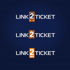
Thank you for your feedback! I understand your comment about the "old style" ticket. The shape is meant more as a "visual element" rather than an actual representation of the current product - similar to how most software still uses the little "floppy disk" symbol to denote the SAVE function, even though nobody has used a floppy for decades - simply because it is a very strong visual icon that says "SAVE", just as this icon says "TICKET".
That said, here are some other possibilities, including a mobile device, a bar code, and a "modern style" ticket with a bar code on it. Not visually as strong as the old-style ticket, but see what you think about these. Thanks again, and cheers from Florida! :) -
This contest is finished. Its not possible to reply anymore.
-
-
-
No comments
-
This contest is finished. Its not possible to reply anymore.
-
-
-
avilevy says :
Nice font and composition. We are not too sure about using an outdated ticket symbol. Tickets are becoming 2d barcodes on mobile devices.
-
This contest is finished. Its not possible to reply anymore.
-


